


Visual hierarchy is the foundation of effective user experience design. It dictates how users perceive information and navigate through an interface. Without a clear structure, users feel lost, overwhelmed, and frustrated. With it, interfaces become intuitive, efficient, and enjoyable to use. This guide explores the core principles that govern how attention is directed, ensuring that the most important elements stand out naturally.
Understanding these principles allows designers to create layouts that respect the user’s cognitive load. It transforms a collection of buttons and text into a coherent story. The goal is not to force the user to look where you want, but to guide them effortlessly through the digital space.
Why Visual Hierarchy Matters in UX 🧠
When a user lands on a screen, their eyes do not scan every pixel equally. The brain filters information based on perceived importance. Visual hierarchy organizes content so that this filtering process aligns with the user’s goals.
- Reduces Cognitive Load: Users spend less mental energy figuring out what to click next.
- Improves Conversion Rates: Primary actions become obvious, leading to higher completion rates.
- Enhances Readability: Text blocks are structured for easy scanning.
- Creates Aesthetic Balance: A well-ordered interface feels professional and trustworthy.
If hierarchy is ignored, users may miss critical information or perform actions they did not intend. The design fails to communicate its purpose clearly. By establishing a clear order, designers ensure that the user’s journey remains smooth and logical.
Core Principles of Visual Hierarchy 🏗️
Several design variables work together to create order. These are the tools available to structure information. Mastering their interplay is key to successful layouts.
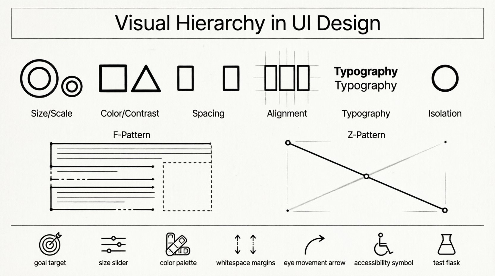
1. Size and Scale 📏
The most immediate way to signal importance is through size. Larger elements naturally draw the eye before smaller ones. This principle applies to text, images, and interactive components.
- Headlines vs. Body Text: A large heading indicates the start of a new section. Body text remains smaller for readability.
- Call-to-Action Buttons: Primary buttons are often larger than secondary options to encourage engagement.
- Images and Icons: Hero images dominate the screen, while small icons provide supplementary details.
Size alone is not enough. It must be paired with contrast. A large grey element on a white background may not stand out as much as a smaller, bold element. The relationship between size and background color determines visibility.
2. Color and Contrast 🎨
Color is a powerful tool for differentiation. It can highlight specific areas or group related items. Contrast ensures that elements are distinguishable from their surroundings.
- Accent Colors: Use a distinct color for links, alerts, or primary actions.
- Background vs. Foreground: High contrast between text and background improves legibility.
- Color Psychology: Red often signals danger or error, while green suggests success or safety.
- Consistency: Using the same color for similar functions helps users build mental models.
Overusing color can dilute its impact. If everything is bright, nothing stands out. Reserve vivid colors for the most critical interactions. Neutral tones should form the base of the interface to keep the focus on the content.
3. Spacing and Whitespace ⏸️
Whitespace, also known as negative space, is the empty area around elements. It is not wasted space; it is an active design element. Proper spacing separates content and prevents clutter.
- Proximity: Items placed close together are perceived as related.
- Grouping: Sections with ample padding between them are distinct.
- Focus: White space around a key element isolates it, making it more prominent.
Without sufficient whitespace, interfaces feel cramped. Users may confuse adjacent elements. Generous spacing creates a sense of luxury and clarity. It allows the eye to rest and process information without distraction.
4. Alignment and Position 📐
Alignment creates order and connection between elements. It establishes a grid that guides the user’s eye across the screen. Consistent alignment makes a layout feel organized.
- Vertical Alignment: Text blocks aligned to the left are easier to read in Western languages.
- Horizontal Alignment: Elements aligned along a horizontal axis create a sense of stability.
- Grid Systems: Using a grid ensures consistency across different screens and devices.
Misaligned elements create visual tension. They feel chaotic and unprofessional. A structured grid allows for flexibility while maintaining a coherent structure. It helps users predict where to find information next.
5. Typography 📝
Typeface selection and formatting play a massive role in hierarchy. Different weights, styles, and font families create distinct layers of information.
- Font Weight: Bold text stands out against regular text.
- Font Style: Italics or uppercase letters can emphasize specific words.
- Font Family: Using different families for headings and body text creates contrast.
- Line Height: Adequate spacing between lines improves readability.
Typography is not just about aesthetics; it is about communication. A clear typographic scale helps users scan content quickly. They can identify headings, subheadings, and body text without reading every word.
6. Isolation and Contrast 🎯
Isolation involves placing an element apart from others to make it unique. This is often used for special offers, alerts, or primary actions.
- Card Design: A card surrounded by whitespace stands out from a list.
- Centering: Centering a button on a full-width background draws immediate attention.
- Shadows: Drop shadows can lift elements off the page, making them feel clickable.
Isolation works because it breaks the pattern. When everything is uniform, the exception becomes the focus. This technique is useful for drawing attention to a specific piece of information without adding visual noise.
User Scanning Patterns 📈
Users do not read interfaces word-for-word. They scan. Understanding how users scan screens helps designers place content where it will be seen.
The F-Pattern
For text-heavy pages, users often scan in an F-shape. They read the top horizontal line, move down the left side, and then scan a second horizontal line.
- Top Line: This is the most important headline.
- Left Side: Key navigation and menu items go here.
- Second Scan: Subheadings and bullet points fit here.
This pattern is common on blogs, news sites, and search results. Placing key information along the top and left side ensures visibility. Content placed in the bottom right corner may be missed.
The Z-Pattern
For landing pages or sparse layouts, users scan in a Z-shape. They move from top-left to top-right, then diagonally down to bottom-left, and finally to bottom-right.
- Top-Left: Logo and navigation.
- Top-Right: Secondary actions or login links.
- Diagonal: Hero image or main value proposition.
- Bottom-Right: Primary call-to-action button.
This pattern is effective for pages with a single goal. It guides the eye naturally from the brand identity to the final action. The diagonal line connects the main image with the primary button.
Western vs. Right-to-Left
Scanning patterns differ based on language and culture. In Western cultures, reading flows left to right. In Arabic or Hebrew interfaces, the flow is right to left.
- Mirror the Pattern: Ensure the Z-pattern or F-pattern is mirrored for RTL languages.
- Localization: Adjust layout direction to match the user’s native reading habit.
- Icons and Symbols: Some symbols imply direction. Ensure they align with the reading flow.
Ignoring cultural scanning habits can confuse users. A layout that works for one region may fail in another. Always consider the target audience when planning the visual flow.
Interactive Elements and Feedback 🖱️
Visual hierarchy extends beyond static layout. It includes how elements react to user input. Interactive states must be clear to prevent confusion.
- Hover States: Buttons should change color or lift when hovered to indicate interactivity.
- Active States: Clicked elements should provide immediate visual feedback.
- Disabled States: Greyed-out elements indicate unavailable actions.
- Focus States: Keyboard navigation requires clear outlines around selected elements.
If an interactive element does not look clickable, users will not use it. Consistent feedback builds trust. It tells the user that the system is responsive and understands their input.
Accessibility Considerations ♿
Visual hierarchy must be accessible to all users, including those with visual impairments. Relying solely on color to convey meaning is a common pitfall.
- Color Contrast: Ensure text meets WCAG contrast ratios against the background.
- Text Alternatives: Use labels and alt text for images and icons.
- Screen Readers: Semantic HTML ensures that screen readers announce elements in the correct order.
- Font Size: Allow users to scale text without breaking the layout.
Accessibility is not an afterthought; it is a core component of hierarchy. If a screen reader cannot distinguish the hierarchy, the design fails for that user. Semantic structure supports both visual and non-visual navigation.
Common Mistakes to Avoid ❌
Even experienced designers can make errors in hierarchy. Recognizing these pitfalls helps in refining designs.
| Mistake | Consequence | Solution |
|---|---|---|
| Too Many Colors | Visual chaos | Limited color palette |
| Uniform Text Sizes | No clear focus | Vary font weights and sizes |
| Cluttered Layouts | High cognitive load | Increase whitespace |
| Weak Contrast | Poor readability | Check contrast ratios |
| Inconsistent Alignment | Disorganized look | Use a grid system |
Reviewing designs against this table helps identify weaknesses. It is easy to miss issues when working closely on a project. Stepping back allows for objective assessment of the visual flow.
Testing Your Hierarchy 🧪
Design is iterative. What looks good on paper may not work in practice. Testing validates the effectiveness of the hierarchy.
- Eye Tracking: Use tools to see where users look first.
- Heatmaps: Analyze where users click and scroll.
- Usability Testing: Ask users to complete tasks and observe their behavior.
- A/B Testing: Compare different layouts to see which performs better.
Data provides objective evidence of success. It removes guesswork from the design process. If users miss the primary button, the hierarchy needs adjustment. Small changes can lead to significant improvements in performance.
Summary of Best Practices ✅
Building a strong visual hierarchy requires attention to detail and a deep understanding of user behavior. Here is a checklist for creating effective interfaces.
- Define the Goal: Know what the user should do first.
- Use Size Wisely: Make important elements larger.
- Leverage Color: Use it to highlight, not decorate.
- Respect Whitespace: Give elements room to breathe.
- Follow Scanning Patterns: Align content with natural eye movement.
- Ensure Accessibility: Make sure everyone can navigate.
- Test Continuously: Validate assumptions with real users.
When these principles are applied consistently, interfaces become powerful tools for communication. They guide users toward their goals without friction. The design becomes invisible, allowing the content and functionality to take center stage.
Visual hierarchy is the silent language of design. It speaks before a word is read. By mastering these principles, designers create experiences that are not only functional but also intuitive. The result is a digital product that respects the user’s time and attention.

