


Understanding where customers move, how they navigate physical and digital spaces, and where friction occurs is critical for modern business strategy. Maps serve as a fundamental visualization tool in this process, translating complex geographic and behavioral data into understandable patterns. However, the choice between interactive and static representations is not merely aesthetic; it impacts data interpretation, stakeholder engagement, and the actionable insights derived from the journey map. 🧭
This guide explores the distinct advantages and limitations of each format. We will examine how static images provide clarity for broad overviews, while interactive models offer depth for granular analysis. By the end, you will have a clear framework for selecting the appropriate visualization method for your specific customer journey mapping needs. 📊
📍 The Role of Geography in Customer Journeys
Customer journeys are rarely confined to a single screen or a linear path. Physical locations, regional preferences, and distribution logistics often play a significant role in how a user interacts with a brand. Whether analyzing foot traffic in retail locations, delivery routes for logistics, or regional support ticket volumes, mapping these touchpoints provides context that spreadsheets cannot offer. 🌍
When visualizing this data, the goal is to reduce cognitive load while maximizing information retention. The format you choose dictates how users consume this information. A static image might be perfect for a printed report, whereas an interactive dashboard allows for real-time filtering. Understanding the distinction helps align the visualization with the intended audience and the decision-making process.
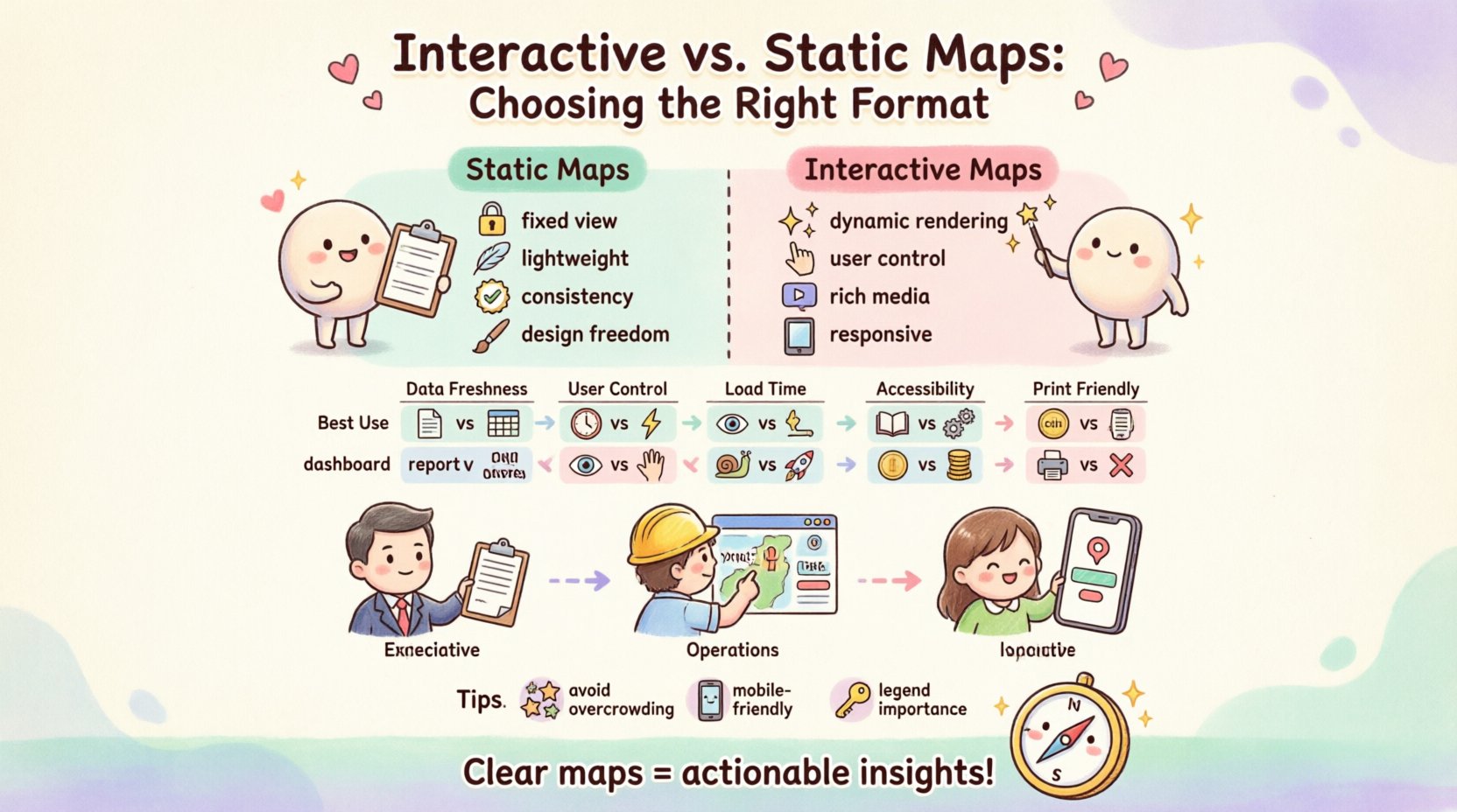
🖼️ Static Maps: Clarity and Control
Static maps are fixed images, typically in formats like PNG, JPEG, or SVG. Once rendered, the elements do not change unless the underlying image is regenerated. In the context of journey mapping, static visuals are often used for documentation, presentations, and high-level summaries. 🖼️
Key Characteristics
- Fixed View: The zoom level, center point, and visible markers remain constant.
- Lightweight: They require minimal bandwidth to load, making them ideal for email attachments or PDF reports.
- Consistency: Every viewer sees the exact same representation, ensuring no variation in interpretation due to different browser configurations.
- Design Freedom: Graphics can be overlaid with custom styling, logos, or annotations that are not always possible in dynamic map engines.
Advantages for Journey Mapping
Static maps excel when the narrative is pre-determined. If you are presenting a finalized journey to a board of directors, you want to guide their attention to specific areas without distraction. Static visuals allow you to highlight specific touchpoints using arrows, color codes, or callouts that remain exactly where you placed them. 📌
- Focus: Prevents users from getting lost in data exploration when they only need to see the high-level path.
- Portability: Easy to embed in slide decks, printed handouts, or marketing materials without needing an internet connection.
- Accessibility: Screen readers can interpret alt text for static images more reliably than complex dynamic scripts, provided they are coded correctly.
Limitations to Consider
While effective for reporting, static maps lack flexibility. If new data points emerge after the image is created, the map must be regenerated. This creates a lag between data collection and visualization. Furthermore, users cannot drill down into specific locations to see secondary data layers. 🚫
- No Drill-Down: Clicking on a region will not reveal more detailed metrics.
- Static Data: Cannot reflect real-time changes in traffic or user behavior.
- Resolution Issues: Zooming in on a large static image often results in pixelation or blurriness.
🖱️ Interactive Maps: Depth and Exploration
Interactive maps allow users to engage directly with the geographic data. Through clicks, drags, zooms, and hover effects, the user becomes an active participant in the analysis. These visualizations are typically rendered via JavaScript libraries or embedded widgets that fetch data dynamically. 🖱️
Key Characteristics
- Dynamic Rendering: Data updates instantly without reloading the page.
- User Control: Viewers can zoom into neighborhoods, filter by date, or toggle heat layers.
- Rich Media Integration: Can include pop-ups with videos, forms, or detailed text descriptions upon interaction.
- Responsive: Adapts to different screen sizes, from desktop monitors to mobile devices.
Advantages for Journey Mapping
Interactive maps are superior for exploratory analysis. When you are trying to understand *why* a journey is failing in a specific region, the ability to isolate variables is crucial. You can overlay multiple data sets, such as customer sentiment scores against location density, to find correlations. 📉
- Data Exploration: Allows analysts to test hypotheses by filtering data on the fly.
- Engagement: Users spend more time on the page when they can manipulate the view, leading to deeper understanding.
- Real-Time Updates: Connects to live APIs to show current conditions, such as weather impacts on delivery or live store traffic.
- Scalability: Can handle millions of data points by clustering them, preventing visual clutter.
Limitations to Consider
The complexity of interactive maps brings challenges. They require more resources to load and render. If the connection is slow, the map may appear blank or lag, frustrating the user. Additionally, ensuring accessibility for keyboard-only users can be difficult with custom map controls. ⚠️
- Technical Dependency: Requires a stable internet connection and browser support.
- Learning Curve: Users must understand how to use the controls to find the information they need.
- Performance: Heavy scripts can slow down overall page load speeds if not optimized.
⚖️ Comparison: Static vs. Interactive
To help you decide, here is a direct comparison of the two formats across critical dimensions relevant to customer journey mapping. 📋
| Feature | Static Map | Interactive Map |
|---|---|---|
| Best Use Case | Reports, Presentations, Print | Dashboards, Analysis, Web Apps |
| Data Freshness | Fixed at generation time | Real-time or near real-time |
| User Control | None (Passive) | High (Zoom, Filter, Hover) |
| Load Time | Very Fast | Variable (Depends on data size) |
| Accessibility | High (Alt text) | Moderate (Requires ARIA labels) |
| Cost | Low (One-time render) | Medium/High (API calls, Hosting) |
| Print Friendly | Yes | No (Requires export) |
🧭 Decision Framework: How to Choose
Selecting the right format depends on the specific goals of your project. There is no single correct answer, but there is a correct answer for your current situation. Consider the following scenarios to guide your decision. 🤔
Scenario A: Executive Summaries and Strategy Sessions
If you are presenting to stakeholders who need to approve a budget or strategy, a static map is often more effective. Executives typically do not have time to explore data layers. They need to see the conclusion. A static image allows you to annotate the map with text boxes explaining the “why” behind the numbers. 📝
- Use Static Maps for quarterly reviews.
- Use Static Maps for printed brochures or wall charts.
- Use Static Maps when the data source is historical and won’t change.
Scenario B: Operational Dashboards and Field Teams
Field operations teams need up-to-the-minute information. If a route is blocked or a store is experiencing inventory issues, a static map cannot help them adapt. Interactive maps allow dispatchers to reroute drivers or managers to see heatmaps of customer complaints in real-time. 🚚
- Use Interactive Maps for live monitoring dashboards.
- Use Interactive Maps for internal tools used by support staff.
- Use Interactive Maps when data is updated frequently (hourly/daily).
Scenario C: Public-Facing Customer Resources
If you are providing a tool for customers to find nearby locations, interactivity is mandatory. Customers expect to zoom in to find a street address or filter by specific services. A static image of a store locator is frustrating and unhelpful for this use case. 🏪
- Use Interactive Maps for store locators.
- Use Interactive Maps for delivery tracking pages.
- Use Interactive Maps for community engagement platforms.
🛠️ Technical Considerations and Performance
Regardless of the format chosen, technical performance plays a vital role in user experience. A slow or broken map can damage trust just as much as incorrect data. Here are key technical factors to evaluate before implementation. ⚙️
Optimization for Static Maps
- Compression: Use modern image formats like WebP or SVG to reduce file size without losing quality.
- Caching: Ensure images are cached by the browser to prevent redundant downloads if the same map appears on multiple pages.
- Resolution: Generate maps at high resolution (2x or 3x) for retina displays to ensure crisp text and icons.
Optimization for Interactive Maps
- Lazy Loading: Load map tiles or data only when the user scrolls to the section containing the map. This improves initial page load speed.
- Clustering: When displaying thousands of data points, use clustering algorithms to group nearby markers. This prevents the map from becoming a single blob of color.
- Timeouts: Implement error handling for API requests. If the map service is down, show a fallback image or message rather than a blank white screen.
♿ Accessibility and Inclusivity
Inclusivity is not an afterthought; it is a requirement for professional journey mapping. You must ensure that users with disabilities can access the information presented on the map. 🦽
Static Map Accessibility
Static images are generally easier to make accessible. The primary requirement is a descriptive alt attribute. This text should describe the key visual elements, such as “Map showing high traffic areas in red and low traffic areas in green across the Northeast region.” 📖
- Alt Text: Provide detailed descriptions of the data visualization.
- Contrast: Ensure the color palette used in the image has sufficient contrast for users with low vision.
- Keyboard Navigation: Not applicable as images are passive, but the page containing them must be navigable.
Interactive Map Accessibility
Interactive maps present more challenges. Screen readers often struggle with canvas-based maps or complex JavaScript controls. To mitigate this, you should provide an alternative text-based data view. For example, a table listing the same data points that appear on the map. 📑
- Keyboard Support: Ensure zoom and pan controls can be activated via keyboard shortcuts.
- ARIA Labels: Use ARIA roles to describe custom map controls to assistive technologies.
- Focus Management: Ensure focus does not get trapped inside the map container when navigating.
📈 Integrating Data Sources
The value of a map lies in the data it represents. Whether static or interactive, the integrity of the underlying data is paramount. In journey mapping, this often involves combining geospatial data with behavioral data. 🔗
Data Hygiene
- Geocoding Accuracy: Ensure addresses are correctly converted to coordinates. Mismatched data leads to misplaced pins, which erodes trust.
- Data Normalization: Ensure all location data uses a consistent coordinate system (e.g., WGS84).
- Privacy Compliance: When mapping individual journeys, ensure you are adhering to GDPR or CCPA regulations. Aggregate data is generally safer than individual tracking.
Layering Insights
Advanced mapping allows you to layer different types of information. For instance, you might layer demographic data over topographic data. In an interactive format, users can toggle these layers on and off. In a static format, this requires creating multiple versions of the image. 🎨
- Sentiment Layers: Overlay emotional sentiment scores (e.g., from surveys) onto physical locations.
- Time-Based Layers: Show how journey paths change during different times of the day or seasons.
- Device Layers: Differentiate between mobile and desktop users if tracking digital touchpoints.
🚧 Common Pitfalls to Avoid
Even with the right format selected, mistakes can occur during the design and implementation phases. Being aware of these common errors can save time and prevent miscommunication. ⚠️
1. Overcrowding the Visual
Trying to show too much information on a single map makes it unreadable. If you have fifty data points in one view, the viewer will miss the signal amidst the noise. Use clustering or filtering to manage density. 🌫️
2. Ignoring Mobile Context
Many users will view journey maps on mobile devices. A map designed for a wide desktop monitor may be unusable on a phone. Ensure interactive controls are large enough to tap, and static images remain legible at small sizes. 📱
3. Assuming One Size Fits All
Different departments need different views. Marketing needs broad awareness, while Operations needs specific coordinates. Avoid creating a single map for all purposes. Create a suite of visuals tailored to each audience. 👥
4. Neglecting the Legend
A map without a legend is a puzzle without a solution. Whether static or interactive, the key must explain what colors and symbols represent. Always include a clear legend or tooltip explanation. 🔑
🔮 Future Considerations in Visualization
The landscape of data visualization is evolving. As technology advances, the line between static and interactive is blurring. You may soon see hybrid formats where a static image is the default, but clicking it expands into an interactive view. 🚀
3D and Spatial Data
As we move toward the metaverse and spatial computing, 2D maps may become insufficient. Understanding how to represent elevation and 3D structures will become relevant for journey mapping in physical spaces like shopping malls or airports. 🏙️
AI-Driven Insights
Artificial Intelligence can automatically generate map insights. Instead of just showing where a customer went, AI can suggest *why* they went there based on historical patterns. This requires robust data infrastructure to support dynamic generation. 🤖
📝 Final Takeaways
Choosing between interactive and static maps is a strategic decision that impacts how your data is consumed and acted upon. Static maps offer simplicity, portability, and control, making them ideal for reporting and high-level strategy. Interactive maps offer depth, flexibility, and real-time capability, essential for operational analysis and public tools. 🛤️
When planning your customer journey mapping initiative, evaluate your audience, your data freshness requirements, and your technical constraints. Do not default to one format without considering the specific context of your project. By aligning the visualization method with the user’s needs, you ensure that the map serves its purpose: turning geographic data into actionable business intelligence. 🧩
Remember that the best map is the one that the user can understand and use effectively. Whether you choose a static image for a boardroom presentation or a dynamic dashboard for your operations team, the goal remains the same. Clear, accurate, and accessible representation of the customer path. 🗺️✨

