


In the modern digital landscape, design is frequently categorized as an expense rather than an investment. Stakeholders often scrutinize budgets, questioning the tangible value of a new interface or a redesign of a core workflow. This skepticism stems from a lack of clear communication regarding how user experience (UX) work translates into business outcomes. To secure resources and maintain strategic influence, designers must shift from presenting aesthetics to presenting data.
Proving Return on Investment (ROI) for design initiatives requires a structured approach. It involves identifying key performance indicators, gathering baseline data, and demonstrating the financial impact of usability improvements. This guide outlines a practical methodology for quantifying design value without relying on specific tools or marketing fluff.
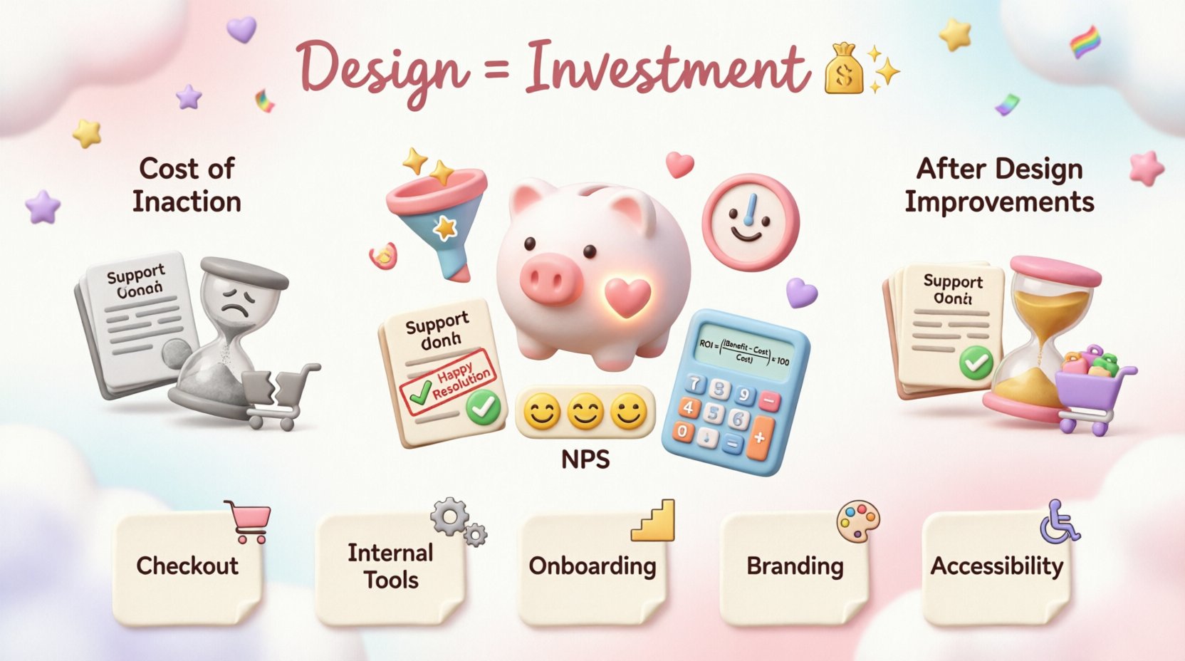
Why ROI Matters for Designers 💰
Design decisions impact the bottom line. A confusing checkout flow can lead to abandoned carts. A poorly organized dashboard can increase training time for employees. When these issues are identified and solved, the business sees a return. However, if the connection between the design change and the financial result is not explicitly stated, the value remains invisible.
Stakeholders speak the language of numbers. They understand revenue, cost reduction, and risk mitigation. When designers align their goals with these metrics, they build credibility. The objective is not to reduce design to mere metrics, but to use metrics to validate the strategic importance of the craft.
The Cost of Inaction
Before calculating the gain from a new initiative, it is often helpful to calculate the cost of maintaining the status quo. This includes:
- Support Costs: Higher volume of tickets related to usability issues.
- Development Waste: Rework caused by unclear requirements or feedback loops.
- Lost Revenue: Conversion rates stagnating or declining due to friction.
- Employee Efficiency: Time spent navigating clunky internal tools.
By quantifying these ongoing costs, you create a baseline against which the design improvement can be measured. This establishes the “cost of doing nothing” scenario.
Defining Success Metrics: Hard vs. Soft Data 📏
Not all value is immediately monetary. Some benefits take time to materialize. A robust reporting strategy combines quantitative (hard) and qualitative (soft) data. Hard data provides the financial justification, while soft data explains the user sentiment behind the numbers.
Hard Metrics (Quantitative)
These are the figures that appear on financial reports. They are directly tied to business KPIs.
- Conversion Rate: The percentage of users who complete a desired action (e.g., purchase, sign-up).
- Task Completion Rate: The percentage of users who successfully finish a specific task.
- Time on Task: The average duration required to complete a goal.
- Support Ticket Volume: The number of help requests generated by the product.
- Customer Acquisition Cost (CAC): How much design quality reduces the friction in the onboarding process.
Soft Metrics (Qualitative)
These metrics measure perception and satisfaction. While harder to convert directly into currency, they predict long-term retention and brand health.
- Net Promoter Score (NPS): Likelihood of a user recommending the product.
- System Usability Scale (SUS): Standardized score of perceived usability.
- Customer Satisfaction Score (CSAT): Immediate satisfaction after an interaction.
- Engagement Depth: How deeply users explore the content or features.
The Calculation Framework 🧮
To determine ROI, you need a clear formula. The standard calculation involves comparing the net gain from the investment against the total cost of the investment.
ROI = ((Benefit – Cost) / Cost) × 100
Here is how to apply this to design initiatives.
Step 1: Identify the Cost
Calculate the total investment required. This includes:
- Designer hours (hourly rate × hours spent).
- Research costs (participant incentives, tool subscriptions).
- Development hours (time engineers spend building the new design).
- Project management overhead.
Step 2: Estimate the Benefit
This is the most challenging step. You must project the financial gain based on data. Common approaches include:
- Conversion Lift: If a landing page currently converts at 2% and research suggests a redesign could push it to 2.5%, calculate the revenue difference based on monthly traffic.
- Efficiency Gains: If a new workflow saves employees 10 minutes per day, multiply that time by the hourly wage and the number of employees.
- Retention Improvement: If churn decreases by 5% due to better onboarding, calculate the Lifetime Value (LTV) of the retained customers.
Comparing Metrics for Different Initiatives 📋
Different design projects require different metrics. A B2B SaaS platform focuses on efficiency, while a B2C e-commerce site focuses on conversion. The table below outlines which metrics to prioritize based on the initiative type.
| Initiative Type | Primary Metric | Secondary Metric | Time to Impact |
|---|---|---|---|
| Checkout Optimization | Conversion Rate | Cart Abandonment Rate | Immediate (Weeks) |
| Internal Tool Redesign | Time on Task | Support Ticket Reduction | Short-term (Months) |
| Onboarding Flow | Activation Rate | Day-30 Retention | Medium-term (Months) |
| Brand Refresh | Brand Sentiment | Direct Traffic Volume | Long-term (Year+) |
| Accessibility Fixes | Compliance Rate | Market Reach Expansion | Medium-term (Months) |
Gathering Data Without Bias ⚖️
Accurate data is the backbone of a valid ROI argument. If the data is flawed, the calculation is meaningless. Avoid common pitfalls in data collection.
Establish a Baseline
You cannot measure improvement if you do not know the starting point. Capture metrics before any changes are made. If historical data is unavailable, run a quick audit to establish current performance levels. Document this clearly so stakeholders see the “Before” state.
Control Variables
In analytics, many factors change simultaneously. A spike in sales might be due to a marketing campaign, not a design change. To isolate the design impact:
- Use A/B Testing: Show the old design to one group and the new design to another. Keep all other variables constant.
- Check Seasonality: Ensure you are not comparing a holiday period to a quiet month.
- Monitor External Factors: Note any changes in pricing, shipping policies, or competitor activity during the test period.
Qualitative Validation
Numbers tell you what happened. User interviews tell you why. If conversion rates drop after a redesign, qualitative feedback might reveal a confusing label or a hidden error message. Use user feedback to explain anomalies in the data.
Presenting the Data to Stakeholders 🗣️
Even the best data can fail to persuade if presented poorly. Stakeholders often have short attention spans and need to grasp the value quickly. Structure your presentation to lead with the outcome, not the process.
The Narrative Arc
Follow a logical story structure:
- The Problem: State the business challenge clearly. (e.g., “Users are dropping off at step three.”)
- The Investigation: Briefly mention the research conducted to understand the cause. (e.g., “We interviewed 15 users and found the form was too long.”)
- The Solution: Describe the design intervention. (e.g., “We simplified the form to two fields.”)
- The Result: Present the data. (e.g., “Completion rates increased by 15%.”)
- The Financial Impact: Translate the result into currency. (e.g., “This saves $50,000 annually in lost leads.”)
Visualizing the ROI
Use charts to make the data digestible.
- Bar Charts: Compare pre-launch vs. post-launch performance.
- Line Graphs: Show trends over time to highlight the shift after implementation.
- Funnel Charts: Illustrate where users drop off and how the new design fills those leaks.
Avoid cluttered spreadsheets. Highlight the specific numbers that matter most. If the ROI is 200%, bold that figure. Make the takeaway impossible to miss.
Long-Term Value vs. Short-Term Wins ⏳
Some design initiatives do not yield immediate financial returns. Branding, accessibility, and design system maintenance are investments that pay off over time. These require a different justification strategy.
Brand Equity
A cohesive visual language builds trust. Users are more likely to purchase from a site that looks professional and consistent. While hard to measure in dollars immediately, brand equity reduces CAC over time because users recognize and trust the company.
Design Systems
Building a library of reusable components takes time upfront. However, it drastically reduces development time for future features. Calculate the savings by estimating how many hours are saved per feature when components are already built.
Accessibility
Ensuring a product is accessible expands the total addressable market. It also mitigates legal risk. Frame accessibility not just as compliance, but as market expansion and risk management.
Common Pitfalls to Avoid 🚫
When calculating ROI, several errors can undermine your credibility. Be aware of these common mistakes.
- Attribution Errors: Claiming credit for a sales spike caused by a marketing email. Only attribute revenue changes to design factors you directly controlled.
- Ignoring Time Costs: Forgetting to include the time designers and developers spent on the project in the cost calculation.
- Over-Promising: Projecting a 50% increase based on a small test sample. Be conservative and acknowledge uncertainty ranges.
- One-Size-Fits-All: Using the same metric for every project. A marketing page needs conversion data; a backend tool needs efficiency data.
- Disregarding Maintenance: Failing to account for the ongoing cost of maintaining a new system. If the new design requires heavy support, the ROI decreases.
Building a Culture of Measurement 🏗️
ROI should not be a one-off report. It should become part of the workflow. Embed measurement into the design process itself.
- Define Goals Early: Before starting work, agree on what success looks like. What metric will we move?
- Set Up Tracking: Ensure analytics are in place before the design goes live.
- Review Regularly: Schedule post-launch reviews to check if the expected ROI was realized.
- Share Learnings: If a project did not yield the expected results, document why. This prevents repeating mistakes and refines future calculations.
Conclusion 📝
Proving the value of design requires patience, precision, and clear communication. It is about translating user needs into business language. By focusing on hard metrics, validating with qualitative data, and presenting findings clearly, designers can demonstrate that their work is a critical driver of organizational success.
When stakeholders see the link between a click, a screen, and a dollar, design moves from a cost center to a strategic asset. This shift empowers teams to advocate for better user experiences with confidence. The goal is not just to justify the budget, but to prove that good design is good business.
Start with one small initiative. Calculate the baseline. Implement a change. Measure the outcome. Document the win. Repeat. Over time, these small proofs accumulate into an undeniable case for the importance of UX in your organization.

