


Making effective UX design choices often feels like navigating a ship through fog. Without clear signals, teams rely on intuition, leading to inconsistent results and features that miss the mark. To navigate with precision, designers must leverage two distinct but complementary sources of intelligence: quantitative data and qualitative data. Understanding how to gather, interpret, and integrate these information streams is essential for creating products that are both functional and human-centered.
This guide explores the mechanics of data-driven design. We will examine what each data type offers, how they function independently, and most importantly, how they combine to form a robust strategy for decision-making. By moving beyond guesswork, you establish a foundation of evidence that supports sustainable product growth.
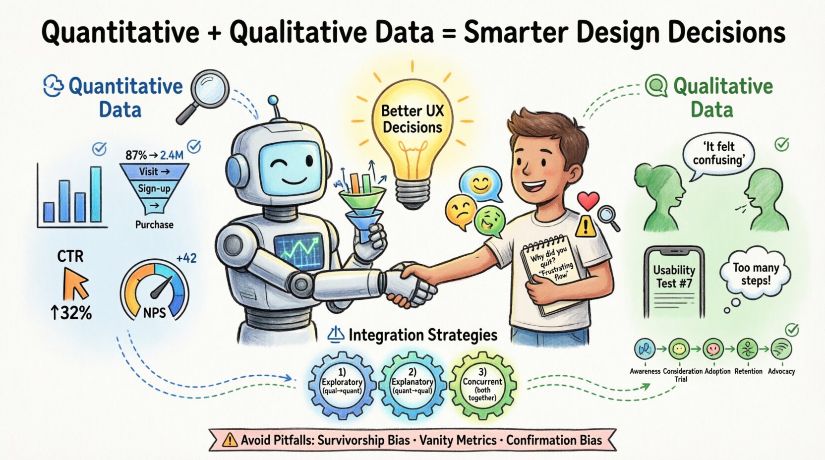
🔢 Understanding Quantitative Data
Quantitative data represents the measurable facts of user interaction. It is numerical, objective, and scalable. When you ask “how many” or “how much,” you are seeking quantitative answers. This data type is typically gathered through automated systems, surveys with closed-ended questions, or A/B testing environments.
The strength of quantitative research lies in its ability to identify patterns across large populations. It tells you what is happening on your platform. However, it rarely explains why it is happening. This distinction is critical for avoiding misinterpretations of user behavior.
- Behavioral Metrics: Click-through rates, session duration, bounce rates, and conversion funnels.
- Demographic Data: Age, location, device type, and language preferences.
- Performance Data: Load times, error rates, and task completion percentages.
- Survey Scores: Net Promoter Score (NPS), System Usability Scale (SUS), and satisfaction ratings.
When analyzing this data, accuracy is paramount. A drop in conversion rate might indicate a broken link, a confusing checkout flow, or a pricing issue. Without further context, the number alone does not provide the solution. It simply flags the existence of a problem.
🗣️ Understanding Qualitative Data
If quantitative data provides the map, qualitative data provides the terrain description. This type of information is descriptive, subjective, and focused on human experience. It captures the motivations, frustrations, and mental models of your users. When you ask “why” or “how,” you are seeking qualitative answers.
This data is often collected through user interviews, usability testing sessions, open-ended survey responses, and customer support logs. It offers depth and nuance that numbers cannot capture. Qualitative insights explain the reasoning behind the actions observed in quantitative reports.
- User Interviews: One-on-one conversations that explore user goals and pain points in detail.
- Usability Testing: Observing users as they attempt to complete tasks to identify friction points.
- Open-Ended Feedback: Text responses from surveys or feedback widgets where users describe their experience freely.
- Contextual Inquiry: Observing users in their natural environment to understand how the product fits into their workflow.
While qualitative research is powerful, it is susceptible to sample bias. A single user’s strong opinion does not represent the entire population. Therefore, relying solely on qualitative data can lead to designing for edge cases rather than the majority. The key is to use it to generate hypotheses that quantitative data can then validate.
⚖️ Comparing the Two Approaches
Designers often face a choice between running a large survey or conducting deep-dive interviews. In reality, both are necessary. The table below outlines the core differences, helping you decide when to deploy each method.
| Feature | Quantitative Data | Qualitative Data |
|---|---|---|
| Primary Question | What is happening? | Why is it happening? |
| Data Type | Numerical, structured | Textual, visual, narrative |
| Sample Size | Large (N=1000+) | Small (N=5-20) |
| Analysis Method | Statistics, visualization | Thematic coding, synthesis |
| Output | Metrics, trends, graphs | Quotes, personas, journey maps |
| Timing | Ongoing, real-time | Project-based, episodic |
| Best Use | Validation, prioritization | Discovery, problem definition |
Understanding these distinctions prevents the common error of using numbers to define problems that require empathy to solve. Conversely, it stops teams from building features based solely on anecdotal stories that do not reflect broader trends.
🔗 Integrating Mixed Methods Research
The most robust design decisions come from triangulation. Triangulation involves using multiple data sources to verify findings. When quantitative and qualitative data align, confidence in a decision increases significantly. When they conflict, it signals a need for deeper investigation.
1. The Exploratory Sequence
Start with qualitative research to understand the problem space. Interview users to identify pain points and unmet needs. Use these insights to form hypotheses about what metrics might be affected. Once you have a hypothesis, use quantitative data to measure the prevalence of the issue across the user base.
- Conduct user interviews to discover confusion around a specific feature.
- Formulate a hypothesis: “Users who cannot find the settings menu abandon the session.”
- Review analytics to see if users with short session times correlate with visits to that page.
- If the data supports the hypothesis, prioritize redesigning the navigation.
2. The Explanatory Sequence
Begin with quantitative data to identify anomalies or trends. Once a metric shifts, use qualitative methods to explain the cause. This is often necessary after a release or when tracking a specific campaign.
- Notice a 15% drop in sign-up completion rates.
- Segment the data to see if the drop affects a specific device or region.
- Recruit users from that segment for usability testing.
- Observe their process to find the specific UI element causing the friction.
- Implement the fix based on the observed behavior.
3. The Concurrent Sequence
Collect both types of data simultaneously during a major research initiative. This provides a comprehensive view of the user landscape. Quantitative data provides the breadth, while qualitative data provides the depth.
- Send a broad survey to gather satisfaction scores.
- Simultaneously invite a subset of respondents for in-depth interviews.
- Correlate low survey scores with specific themes mentioned in interviews.
- Create a prioritized backlog based on the combined evidence.
⚠️ Common Pitfalls in Data Interpretation
Even with access to rich data, teams often stumble due to cognitive biases or methodological errors. Being aware of these traps helps maintain the integrity of the design process.
1. Survivorship Bias
Survivorship bias occurs when you focus only on the “survivors” or successful users and ignore those who dropped out. For example, if you only interview users who have completed a subscription, you will miss the insights from those who churned. Ensure your sampling methods capture the full journey, including drop-off points.
2. Vanity Metrics
It is tempting to focus on metrics that look good but do not reflect user value. High page views might indicate engagement, but they could also indicate users are struggling to find what they need and clicking around aimlessly. Focus on outcome metrics like task completion rates or retention rather than output metrics like clicks.
3. Confirmation Bias
Designers often seek data that supports their pre-existing ideas. If you believe a feature is good, you might interpret ambiguous feedback as positive. Actively seek disconfirming evidence. Ask, “What data would prove this hypothesis wrong?” and look for that specific signal.
4. Ignoring Context
Numbers without context are meaningless. A 5% conversion rate might be excellent for a high-ticket B2B service but disastrous for a mobile game. Always compare metrics against industry benchmarks and historical internal data to understand the true significance of a number.
5. Over-Reliance on Self-Reported Data
Users often say one thing and do another. In surveys, people may claim they would use a feature, but actual usage data shows they never touch it. Always validate self-reported intentions with behavioral evidence whenever possible.
🛠️ Implementation Workflow
Integrating data into the design workflow requires a structured approach. It should not be an afterthought but a continuous loop throughout the product lifecycle.
- Discovery Phase: Use qualitative methods (interviews, ethnography) to define the problem. Use quantitative benchmarks to set baseline expectations for the solution.
- Design Phase: Create prototypes based on insights. Use qualitative testing on low-fidelity prototypes to catch major usability issues early. Use quantitative data to prioritize which features to design first.
- Development Phase: Ensure tracking is implemented correctly. Verify that the analytics setup captures the necessary events before the code is released.
- Launch Phase: Monitor quantitative dashboards immediately. Prepare for qualitative follow-ups to explain any unexpected shifts in behavior.
- Iteration Phase: Review the data periodically. Identify areas for improvement. Return to the discovery phase to validate new hypotheses.
This workflow ensures that data informs every stage, rather than just validating a finished product. It shifts the culture from “build and hope” to “learn and adapt.”
📈 Measuring Success and Impact
How do you know if your data-driven approach is working? Success is not just about better metrics; it is about better decisions. You can measure the effectiveness of your research strategy by tracking the following indicators.
- Decision Velocity: How quickly does the team move from hypothesis to action? Good data reduces debate and accelerates consensus.
- Feature Adoption: Are new features being used as intended? Qualitative feedback helps understand adoption barriers, while quantitative data confirms adoption rates.
- Reduction in Support Tickets: If users are finding what they need, support volume should decrease. This is a strong signal that usability has improved.
- User Retention: Long-term retention is often the best indicator of product-market fit. Data-driven design aims to keep users engaged over time.
- Stakeholder Confidence: When decisions are backed by evidence, stakeholder pushback decreases. This allows designers to advocate for user needs more effectively.
🌱 Future Trends in Data Integration
The landscape of user research is evolving. New technologies are making it easier to gather and synthesize data without heavy manual overhead. However, the core principles of combining numbers with narratives remain constant.
- Automated Sentiment Analysis: Tools can now analyze open-ended text responses to identify emotional tones, bridging the gap between qualitative text and quantitative scoring.
- Real-Time Behavioral Tracking: Heatmaps and session replays provide immediate visual context for quantitative clicks, offering a layer of qualitative-like insight into behavior.
- Predictive Modeling: Advanced analytics can forecast user churn or lifetime value based on early behavior patterns, allowing teams to intervene proactively.
- Privacy-Centric Analytics: As regulations tighten, teams are moving toward aggregated data that protects user privacy while still providing actionable insights.
🚀 Actionable Steps for Your Team
If you are ready to improve your design decision process, start with these practical steps.
- Audit Your Current Data: List what data you currently have access to. Identify gaps where you are making decisions without evidence.
- Define Key Questions: Before running research, write down the specific questions you need to answer. This prevents data collection for the sake of collecting data.
- Establish a Baseline: Know your current metrics before making changes. This allows you to measure the impact of your design updates accurately.
- Create a Feedback Loop: Schedule regular reviews where the team discusses both quantitative reports and qualitative findings together.
- Train the Team: Ensure developers, product managers, and designers understand how to interpret the data. Common literacy reduces miscommunication.
By committing to a balanced approach, you move away from opinion-based design toward evidence-based design. This shift takes time and discipline, but the results are tangible improvements in user satisfaction and business performance. The goal is not just to collect data, but to understand the human story behind the numbers.
🔍 Final Thoughts on Evidence
Data is a tool, not a replacement for judgment. It provides the evidence needed to support human intuition and creativity. When quantitative and qualitative data work in harmony, they create a complete picture of the user experience. This clarity empowers teams to make bold moves with confidence, knowing that their choices are grounded in reality. As you continue to refine your process, remember that the best insights often come from the tension between what the numbers say and what the users feel.
Start small. Pick one feature or flow and apply both types of research to it. Document the process. Measure the outcome. Over time, this practice becomes the standard operating procedure for your entire organization, leading to products that truly serve the people who use them.

