


Information Architecture (IA) serves as the structural foundation for any digital product. It determines how content is organized, labeled, and navigated. Without a solid IA, even the most beautiful designs fail because users cannot locate what they need. For a junior designer, understanding these structural principles is just as critical as mastering visual aesthetics. This guide explores the core components, methods, and best practices required to build logical and user-centered structures.
🔍 What Exactly Is Information Architecture?
Information Architecture is the art of organizing and structuring content within a website or application. It is the blueprint that guides users through a digital environment. Think of it as the floor plan for a building; just as a building needs a logical layout to function, a digital product needs a clear structure to be usable.
While visual design captures attention, IA ensures functionality. It answers fundamental questions:
- Where is the content?
- How do I get there?
- What is this content?
- How does this relate to other content?
Effective IA reduces cognitive load. When users do not have to think hard about where to click or what a label means, they can focus on their tasks. This leads to higher satisfaction and better conversion rates. It is a discipline that sits at the intersection of user research, content strategy, and interaction design.
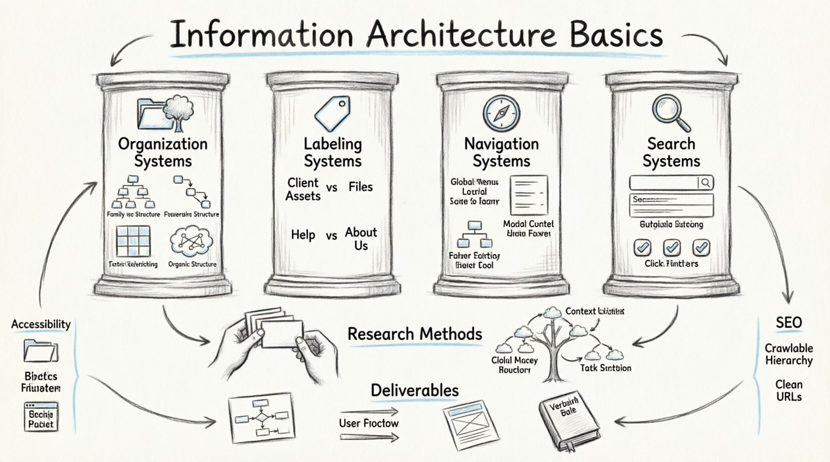
🏛️ The Four Pillars of Information Architecture
According to industry standards, there are four main systems that comprise IA. These pillars work together to create a cohesive experience. Understanding each one is essential for designing structures that scale.
1. Organization Systems 📂
Organization systems define how information is grouped. The goal is to group items in a way that makes sense to the user, not necessarily to the business. Common approaches include:
- Hierarchical: The most common structure. It groups content into categories and subcategories. Think of a family tree or a filing cabinet system.
- Sequential: Used for tasks that require a specific order, such as a checkout process or a registration wizard.
- Matrix: Allows users to browse content using multiple attributes simultaneously. For example, searching for a hotel by location and price.
- Organic: Groups content based on user associations rather than predefined categories. This often relies heavily on user research.
2. Labeling Systems 🏷️
Labels are the words used to describe content. The challenge is to use terminology that users understand, not internal jargon. A label must be clear, concise, and consistent.
Consider the difference between “Client Assets” and “Files.” The former is internal language; the latter is user language. Good labeling reduces ambiguity. If a user sees “Help,” they expect support documentation. If they see “About Us,” they expect company history.
3. Navigation Systems 🧭
Navigation elements allow users to move through the structure. This includes primary menus, secondary menus, breadcrumbs, and footers. Navigation must align with the mental models of the target audience.
- Global Navigation: Appears on every page. It represents the core sections of the site.
- Local Navigation: Appears within a specific section. It helps users navigate that specific area.
- Contextual Navigation: Appears based on the content context. It offers relevant links to related information.
- Utility Navigation: Contains tools like login, search, or language selection.
4. Search Systems 🔎
Not all users navigate. Some prefer to search. A robust search system complements navigation. It should offer auto-complete, filters, and relevant ranking. If the structure is unclear, search becomes the safety net. However, relying solely on search often indicates a weak structure.
📊 Comparing Organization Systems
To better understand the trade-offs, consider the following comparison of common organization structures:
| System Type | Best Use Case | Pros | Cons |
|---|---|---|---|
| Hierarchical | Large content libraries, e-commerce | Intuitive, scalable | Can become deep and cluttered |
| Sequential | Workflows, onboarding | Clear progress, step-by-step | Cannot skip steps, rigid |
| Matrix | Databases, complex filtering | Flexible, multi-dimensional | Complex to implement, confusing labels |
| Organic | News sites, blogs | Emergent, adaptable | Hard to predict, inconsistent |
🧪 Research Methods for Structuring
Designing structure based on assumptions is risky. Validating your structure with users is a crucial step. There are specific methods used to test and define IA before high-fidelity design begins.
Card Sorting
Card sorting is a technique where participants group content items into categories that make sense to them. This reveals their mental models.
- Open Card Sorting: Participants create their own category names. This is useful for discovering new labels.
- Closed Card Sorting: Participants sort items into predefined categories. This validates existing structures.
During this process, observe where users hesitate. If a specific item is placed in multiple categories, it indicates ambiguity in labeling. This data informs the final sitemap.
Tree Testing
Once the structure is defined, tree testing validates it. This involves presenting users with a text-only version of the site structure. They are given tasks, such as “Find the return policy,” and must click through the hierarchy to find the answer.
Key metrics include:
- Success Rate: Percentage of users who found the correct path.
- Directness: Did they take the most efficient route?
- Depth: How many clicks did it take to reach the content?
High failure rates in tree testing indicate a structural flaw that must be addressed before visual design starts.
📄 Deliverables and Documentation
As a designer, you must communicate your structure to stakeholders and developers. Clear documentation ensures everyone is aligned. The primary deliverables include:
- Sitemaps: Visual diagrams showing the hierarchy of pages. They can be hierarchical charts or flowcharts.
- User Flows: Diagrams that map the path a user takes to complete a specific task. This highlights decision points and loops.
- Wireframes: Low-fidelity layouts that show where content lives within the structure.
- Glossaries: Lists of approved terms and definitions to ensure consistency across the product.
Documentation should be living. As the product evolves, the IA changes. Keeping these documents updated prevents technical debt and confusion.
🌳 Hierarchy and Taxonomy
Taxonomy is the classification of information. It defines the rules for grouping. A good taxonomy is logical, scalable, and sustainable.
Flat vs. Deep Hierarchy
Choosing the right depth is a balancing act.
- Flat Structure: Fewer clicks to reach content. Good for small sites. However, it can overwhelm the main navigation.
- Deep Structure: More clicks, but less clutter. Good for large sites with distinct sections. However, users may get lost or feel distant from the content.
Aim for a balance. Most users prefer to stay within three clicks of the homepage. If content requires more, it should be easily accessible via search or related links.
♿ Accessibility in Information Architecture
IA directly impacts accessibility. Users with cognitive disabilities or those using screen readers rely heavily on clear structures.
- Consistent Navigation: Navigation should appear in the same location on every page.
- Descriptive Links: Avoid “Click here.” Use “Read our privacy policy” so screen reader users know the destination.
- Breadcrumbs: These help users understand their location within the hierarchy.
- Heading Structure: Use logical heading levels (H1, H2, H3) to denote content importance.
A well-structured site is inherently more accessible. If a screen reader cannot parse the hierarchy, the content is effectively locked away.
🔄 Common Pitfalls to Avoid
Even experienced designers make mistakes. Being aware of common pitfalls helps junior designers avoid them.
- Assuming User Knowledge: Do not assume users know internal acronyms. Use plain language.
- Over-Complicating Navigation: Limit menu items. Cognitive load increases with every option presented.
- Neglecting Search: Even with good navigation, search is necessary. Ensure it is visible and functional.
- Ignoring Content: IA is not just about pages. It is about the content within them. Content inventory is a vital first step.
- Designing Before Research: Do not start wireframing before you understand the content and user needs.
🤝 Collaboration and Iteration
IA is rarely a solo effort. It requires collaboration with content strategists, developers, and product managers.
- With Content Strategists: Ensure the structure supports the content goals.
- With Developers: Understand technical constraints. Some structures are easier to build than others.
- With Stakeholders: Explain the value of structure. A clear sitemap reduces development time and maintenance costs.
Iteration is key. User behavior changes. New content is added. The IA must evolve to accommodate these changes. Regular audits help identify broken links, outdated content, or confusing labels.
🔗 Connecting IA to SEO
Search Engine Optimization (SEO) relies heavily on IA. Search engines crawl and index content based on structure.
- Crawlability: A clear hierarchy helps bots understand the site.
- Internal Linking: Links distribute authority. Logical navigation facilitates this.
- URL Structure: URLs should reflect the hierarchy. For example, /products/shoes/running.
If the structure is messy, search engines may struggle to rank the content. A strong IA supports both user experience and visibility in search results.
🛠️ Tools for Implementation
While specific software names are not required, the types of tools used matter. You need tools that facilitate diagramming and collaboration.
- Diagramming Tools: For creating flowcharts and sitemaps.
- Whiteboarding Tools: For brainstorming sessions with stakeholders.
- Documentation Platforms: For maintaining living style guides and taxonomies.
The tool is less important than the process. Focus on clarity and communication regardless of the platform used.
🚀 Moving Forward as a Designer
Mastering IA is a journey. It requires patience and empathy. You must constantly put yourself in the user’s shoes. Ask yourself why a user would look for something and where they would expect to find it.
Start by auditing existing products. Look at major sites and analyze their structure. What makes their navigation easy? Where do you get lost? This practice builds intuition.
Remember that structure is invisible. When it works well, users do not notice it. They simply find what they need. Your goal is to make the invisible visible through clear logic and thoughtful design.
📝 Summary of Key Takeaways
- Foundation: IA is the blueprint for digital products.
- Pillars: Organization, Labeling, Navigation, and Search are essential.
- Research: Use card sorting and tree testing to validate structure.
- Documentation: Sitemaps and user flows communicate the vision.
- Accessibility: Structure supports all users, including those with disabilities.
- Iteration: IA evolves with the product and user needs.
By focusing on these basics, you build a strong foundation for your career. Structure drives success. Invest time in getting it right, and the rest of the design process will flow more smoothly.

