


Creating a UX portfolio is about more than displaying beautiful screenshots. It is about telling a story of how you solve problems. Hiring managers are not looking for art galleries; they are looking for evidence of your thinking process. A strong case study demonstrates your ability to navigate ambiguity, collaborate with teams, and drive measurable results.
This guide outlines the specific components required to build a compelling case study. It focuses on structure, clarity, and the narrative arc that keeps readers engaged from the first sentence to the final takeaway.
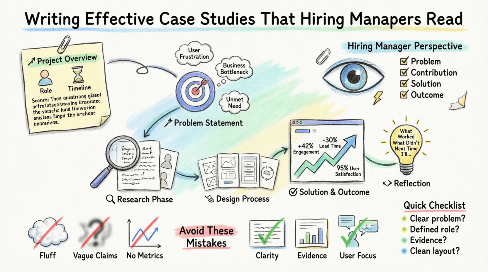
Understanding the Hiring Manager’s Perspective 🧠
Before you write a single word, you must understand who is reading your work. A hiring manager or recruiter typically scans a portfolio quickly. They might spend less than two minutes on a single case study. Therefore, the information hierarchy is critical.
- What they want to see: Problem definition, your specific contribution, the solution, and the outcome.
- What they ignore: Fluff, overly decorative layouts, and vague claims without evidence.
- Their goal: To determine if you can handle the responsibilities of the role they are hiring for.
When you write, imagine you are explaining your work to a peer who is familiar with design but not with the specific project. Clarity is your primary tool. Avoid jargon where plain language suffices. If you use a technical term, define it briefly.
Your case study serves as proof of competence. It answers the question: Can this person think critically and execute effectively? To answer this, you must be honest about the challenges you faced. Perfect projects rarely exist. Discussing friction, feedback, and iteration shows maturity.
The Anatomy of a Winning Case Study 🏗️
Structure provides the skeleton for your narrative. Without it, even the best insights can get lost in a wall of text. Most successful case studies follow a logical flow that mirrors the design process itself.
1. The Project Overview 🚀
Start with a summary that captures the essence of the project. This section should be concise, ideally under 100 words. It sets the context for the reader.
- Project Title: Clear and descriptive.
- Timeline: How long did it take?
- Role: What was your specific responsibility?
- Team Size: Did you work alone or with a group?
- Outcome: A one-sentence summary of the result.
Include a hero image that represents the solution. This is the first visual impression, so ensure it is high quality and relevant. Avoid generic stock photos. Use actual interface shots or diagrams that represent the work.
2. The Problem Statement 🎯
Define the problem clearly. A vague problem leads to a vague solution. Explain what user pain points existed or what business goals needed to be met.
- Context: Why was this project necessary?
- Users: Who were you designing for?
- Challenges: What constraints existed? (Time, budget, technology)
Do not simply say the product needed “better usability.” Be specific. Did users fail to complete checkout? Was customer support overwhelmed by tickets? Quantify the problem if possible.
3. The Research Phase 🔍
Research is the foundation of good design. Show that your decisions were data-driven, not based on intuition alone.
- Methods: User interviews, surveys, competitive analysis, heuristic evaluation.
- Key Findings: What did you learn? Highlight three to five major insights.
- Personas: If you created them, explain why they matter.
Share the raw data briefly. Photos of whiteboard sessions, notes from interviews, or excerpts from survey results add authenticity. This proves you actually did the work.
4. The Design Process 🛠️
This is often the longest section. It shows how you turned research into a solution. Walk the reader through your iterations.
- Sketching: Show early ideas to demonstrate volume and exploration.
- Wireframes: Low-fidelity layouts that establish structure.
- Prototyping: How you tested interactions.
- Feedback Loops: How you incorporated stakeholder and user feedback.
Explain the “why” behind key design decisions. Did you move the button? Why? Did you change the color scheme? Why? Connect the design change back to the user insights gathered earlier.
5. The Solution and Outcome ✅
Present the final design. This is the moment of revelation. Use high-fidelity mockups to show the polished interface.
- Final Interface: Show key screens.
- Metrics: Did conversion improve? Did time-on-task decrease?
- Business Impact: How did this help the organization?
If you do not have hard numbers, discuss qualitative feedback. Did users say they understood the app better? Did stakeholders approve the launch? Honesty about limitations is acceptable. If the project is still in progress, state that clearly.
6. Reflection and Next Steps 🔄
End with a look forward. What did you learn? What would you do differently? This shows a growth mindset.
- Lessons Learned: Specific takeaways from the process.
- Future Work: Ideas for the next iteration.
This section humanizes you. It shows you are committed to continuous improvement.
Structuring Information for Readability 📊
Large blocks of text are difficult to scan. Use formatting tools to break up content. Visual hierarchy guides the eye.
Consider using a table to summarize project details. This allows readers to grasp the scope immediately without reading paragraphs.
| Category | Details |
|---|---|
| Project Goal | Increase user retention by 15% within six months. |
| Duration | 12 Weeks (Discovery to Handoff) |
| Role | Lead UX Designer |
| Tools Used | Design and prototyping software |
| Team | 2 Developers, 1 PM, 1 QA |
Use bold text to highlight key points within paragraphs. This helps skimmers find the most important information. However, do not overuse bolding. Reserve it for emphasis only.
Writing Style and Tone ✍️
Your writing should be professional yet accessible. It should reflect your personality without being overly casual.
- Active Voice: Use “I designed” instead of “The design was created.” This asserts ownership.
- Conciseness: Remove unnecessary words. Get straight to the point.
- Clarity: Avoid acronyms unless they are industry standard.
- Storytelling: Treat the case study as a narrative arc with a beginning, middle, and end.
Write for the user, not for the algorithm. While SEO is important, the primary audience is human. If a sentence is confusing, rewrite it. If a paragraph is too long, split it.
Common Mistakes to Avoid 🚫
Many designers make the same errors repeatedly. Identifying these pitfalls early can save you time and improve your portfolio quality.
| Mistake | Why It Fails | How to Fix It |
|---|---|---|
| Lack of Context | Readers don’t understand why the project existed. | Define the problem and constraints clearly at the start. |
| Focus on Aesthetics | It looks like a gallery, not a process. | Emphasize the research and reasoning over final visuals. |
| Missing the User | It feels like you designed for yourself. | Reference user quotes, data, and personas throughout. |
| Vague Outcomes | Success is undefined. | Use metrics or specific feedback to prove value. |
| No Personal Role | It is unclear what you actually did. | Use “I” statements to describe your specific contributions. |
Visuals and Assets 🖼️
Images are essential, but they must be relevant. Do not upload every screenshot you ever made. Curate your selection.
- Hero Image: The main visual for the top of the page.
- Process Shots: Photos of whiteboards, sticky notes, or sketches.
- Interface Screens: Clean, high-resolution images of the final product.
- Diagrams: User flows or journey maps that explain logic.
Ensure all images are optimized for web. Large file sizes slow down loading times, which hurts the user experience of your portfolio itself.
When showing user flows, add labels. A diagram without text is often confusing. Explain the steps in the flow briefly.
Case Study Checklist ✅
Before publishing, run through this checklist to ensure quality.
- Is the problem clear? Can someone understand the issue in 30 seconds?
- Is your role defined? Do readers know what you did versus what the team did?
- Is there evidence? Do you have data, quotes, or artifacts to back up claims?
- Is the layout clean? Is there enough whitespace? Are fonts readable?
- Is the mobile view tested? Does it look good on phones and tablets?
- Are links working? Check all external links and buttons.
- Is the spelling correct? Typos suggest carelessness.
Iterating Your Own Work 🔄
A case study is not static. As you gain experience, you will revisit your old work. You might find a better way to explain a process or discover new data. Updating older case studies is a great way to show growth.
If you are working on a project that is still ongoing, note that status. You can share the progress made so far. This shows you are currently active and working.
Ask peers to review your case studies. Fresh eyes catch things you miss. They can tell you if the narrative flows or if it gets stuck in technical details.
The Impact of a Strong Portfolio 🌟
A well-written case study differentiates you in a competitive market. It moves the conversation from “Can you use the tools?” to “Can you solve problems?”
It demonstrates communication skills. Design is a collaborative effort. Being able to articulate your thinking is just as important as the design itself.
It builds trust. When you show your work transparently, including the failures and learnings, you show integrity. Hiring managers value honesty over perfection.
Take the time to craft each piece. Quality over quantity. Three strong case studies are better than ten mediocre ones. Focus on depth rather than breadth.
Final Thoughts on Storytelling 📖
Every project has a story. Your job is to tell it in a way that resonates. Start with the human element. Who did you help? What difficulty did you remove from their life?
Keep the reader engaged by varying the content. Mix text with visuals. Use bullet points for lists. Use tables for data. Keep the pacing steady.
Remember that your portfolio is a living document. It evolves as you do. Treat it with care, and it will serve you well throughout your career.

