Modeling software architecture requires precision. When capturing the behavior of a system, selecting the correct Unified Modeling Language (UML) interaction diagram is critical for clarity. Interaction diagrams represent how objects work together over time or space. Among the most common choices are the Sequence Diagram, the Communication Diagram, and the Interaction Overview Diagram.
Each serves a distinct purpose. A Sequence Diagram emphasizes the timeline of messages. A Communication Diagram focuses on object relationships. An Interaction Overview Diagram manages complex flows and branching logic. Confusion between these can lead to miscommunication among developers and stakeholders. This guide provides a deep dive into the mechanics, use cases, and structural differences of each type.
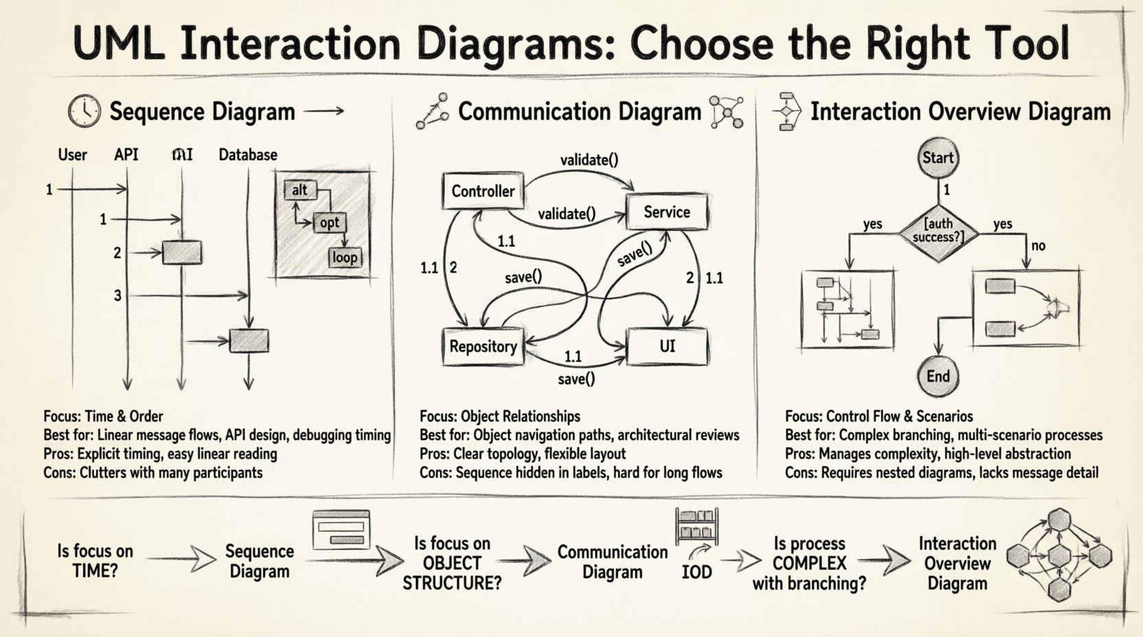
📉 Understanding Sequence Diagrams
Sequence diagrams are the most widely recognized interaction diagram. They arrange objects or participants horizontally and time vertically. This layout makes it easy to follow the chronological order of events.
Core Mechanics
- Lifelines: Vertical dashed lines represent objects or system components.
- Messages: Arrows between lifelines show data or method calls.
- Activation Bars: Rectangles on lifelines indicate when an object is actively processing a request.
- Combined Fragments: Boxes labeled with keywords like
alt,opt, orloopdefine conditional or repetitive behavior.
When to Use a Sequence Diagram
Choose this diagram when the order of operations is the most important factor. It is ideal for:
- Detailing complex message flows between multiple objects.
- Designing specific methods or API endpoints.
- Visualizing the lifecycle of a transaction.
- Debugging timing issues or race conditions in logic.
Sequence diagrams excel at showing when something happens. They do not inherently show where the objects are located relative to each other, nor do they handle high-level control flow well.
Strengths and Limitations
The primary strength is clarity regarding timing. A developer can trace a request from entry to exit without ambiguity. However, they become cluttered quickly. If a system has many parallel processes or complex branching logic, the diagram can become a tangled web of arrows.
- Pros: Time-ordering is explicit. Easy to read for linear flows.
- Cons: Difficult to show object topology. Can become messy with many participants.
🔗 Understanding Communication Diagrams
Formerly known as Collaboration Diagrams, Communication Diagrams focus on the structural organization of objects rather than the sequence of messages. They display objects as nodes and messages as labeled links.
Core Mechanics
- Objects as Nodes: Boxes represent instances or classes involved in the interaction.
- Links as Connections: Lines connect related objects.
- Numerical Labels: Messages are numbered to indicate sequence (1, 1.1, 1.2) rather than spatial position.
- Navigation Paths: The diagram shows how one object navigates to another to send a message.
When to Use a Communication Diagram
This type is best suited for scenarios where the relationship between objects matters more than the exact timestamp. Consider this for:
- Visualizing the network of objects required for a feature.
- Understanding navigation paths across an object graph.
- High-level architectural reviews where structure is key.
- Scenarios with fewer messages but complex object connections.
Communication diagrams provide a topological view. They help answer questions like, “Which objects need to talk to each other?” rather than “What happens first?”
Strengths and Limitations
The layout is flexible. You can arrange nodes to make the relationships clear. However, the sequence is less intuitive. Because messages are numbered, you must read the labels to understand the flow, rather than scanning from top to bottom.
- Pros: Shows object relationships clearly. Good for complex object graphs.
- Cons: Sequence is hidden in labels. Hard to read for long, linear processes.
🔄 Understanding Interaction Overview Diagrams
Interaction Overview Diagrams (IOD) combine elements of Activity Diagrams and Interaction Diagrams. They provide a high-level view of a process that consists of multiple interaction scenarios.
Core Mechanics
- Nodes: Activity diagram nodes (circles, diamonds) control the flow.
- Interaction Frames: Boxes containing Sequence or Communication diagrams act as sub-nodes.
- Control Flow: Arrows between frames indicate the transition from one interaction scenario to another.
- Branching: Decision points determine which interaction path to follow.
When to Use an Interaction Overview Diagram
IODs are powerful for macro-level modeling. They are appropriate when:
- A single feature spans multiple distinct interaction sequences.
- You need to show loops or conditional branching across different object interactions.
- The system behavior is too complex for a single Sequence Diagram.
- Documenting a user journey that involves multiple system states.
Think of the IOD as the table of contents for your interaction modeling. It guides the reader to the specific Sequence or Communication diagrams needed for each step.
Strengths and Limitations
The main advantage is abstraction. You can show the big picture without getting bogged down in message details. This keeps documentation manageable. The downside is that it lacks message-level detail. It does not show the internal logic of the interactions within the frames.
- Pros: Manages complexity. Combines control flow with interaction details.
- Cons: Requires detailed nested diagrams. Not suitable for single-step logic.
⚖️ Key Differences at a Glance
To clarify the distinctions, we can compare the three diagram types across several dimensions. This table helps identify which tool fits specific documentation needs.
| Feature | Sequence Diagram | Communication Diagram | Interaction Overview Diagram |
|---|---|---|---|
| Primary Focus | Time and Order | Object Relationships | Control Flow & Scenarios |
| Layout | Vertical Time Axis | Flexible Topology | Activity Flow |
| Best For | Linear message flows | Object navigation paths | Complex branching logic |
| Detail Level | High (Message Level) | Medium (Link Level) | Low (Scenario Level) |
| Complexity Handling | Low to Medium | Medium | High |
🧭 Decision Framework: Choosing the Right Diagram
Selecting the correct diagram depends on the specific goal of your documentation. Use the following framework to evaluate your scenario.
1. Is the Focus on Time?
If your stakeholders need to know exactly when a database commit happens relative to an API response, a Sequence Diagram is the correct choice. The vertical axis provides an immediate visual representation of latency and ordering.
2. Is the Focus on Object Structure?
If the architecture relies on a specific network of services or objects communicating frequently, a Communication Diagram clarifies the topology. It shows that Object A talks to Object B, and Object B talks to Object C, without requiring a strict timeline.
3. Is the Process Complex?
If the feature involves multiple decision points, retries, or alternative paths, a single Sequence Diagram will become unreadable. An Interaction Overview Diagram breaks the process into manageable chunks. Each chunk can be a Sequence Diagram.
🛠️ Practical Scenarios
Let us explore how these diagrams apply to real-world modeling tasks.
Scenario A: User Login System
A user enters credentials, the system validates them, and issues a token. This is a linear flow.
- Recommended: Sequence Diagram.
- Reason: The order of validation steps is critical. The top-down flow matches the user experience.
Scenario B: E-Commerce Inventory Check
An order request checks multiple warehouses. If one fails, it tries another. It updates the database if successful.
- Recommended: Interaction Overview Diagram.
- Reason: This involves branching logic (if/else). The IOD can show the decision node and link to specific Sequence diagrams for each warehouse check.
Scenario C: Microservice Communication
Service A calls Service B, which calls Service C. Service C also calls Service D.
- Recommended: Communication Diagram.
- Reason: The architecture is defined by the connections. Showing the graph of services is more valuable than the timing of messages.
⚙️ Advanced Modeling Techniques
Effective modeling often involves combining these diagrams. Understanding how they interact improves the overall documentation quality.
Nesting Interactions
You can nest an Interaction Overview inside another Interaction Overview. This allows for hierarchical documentation. However, keep the depth shallow to maintain readability.
Combining with Activity Diagrams
An Interaction Overview is essentially a specialized Activity Diagram. You can use standard Activity Diagram notation for control flow and insert Interaction Frames for the heavy lifting. This hybrid approach is common in large-scale system design.
Refining with Frames
Use frames to group related interactions. In a Sequence Diagram, a frame can represent a specific use case or user story. In an Interaction Overview, frames represent the sub-processes.
⚠️ Common Pitfalls to Avoid
Even experienced modelers make mistakes. Watch out for these common errors.
- Overloading Sequence Diagrams: Do not put every possible interaction in one diagram. Split by feature or use case.
- Neglecting the IOD: If you have five Sequence Diagrams for one feature, you likely need an IOD to tie them together.
- Ignoring Object Identity: In Communication Diagrams, ensure object instances are clearly labeled. Ambiguity leads to confusion about which data is being passed.
- Missing Return Messages: In Sequence Diagrams, return messages are often omitted. Include them if the response data is significant.
- Ignoring Self-Interactions: Sometimes an object processes data before sending it on. Show this with a self-loop in Sequence diagrams.
📝 Best Practices for Documentation
Consistency is key. Establish a standard for your team regarding how these diagrams are created.
- Standardize Notation: Agree on how to represent messages, returns, and fragments.
- Maintain Synchronization: Ensure diagrams match the current codebase. Outdated diagrams are worse than no diagrams.
- Use Clear Labels: Message labels should describe the intent, not just the method name (e.g., “Send Notification” vs “notifyUser”).
- Keep it Simple: If a diagram requires a legend to be understood, it is too complex. Simplify the model.
🔍 Technical Nuances
Understanding the technical underpinnings helps in applying the diagrams correctly.
Message Passing vs. Navigation
Sequence diagrams show message passing. Communication diagrams show navigation. In object-oriented programming, navigation happens through object references. Message passing happens through method calls. Both diagrams model these, but with different visual emphasis.
State vs. Interaction
Do not confuse Interaction Diagrams with State Machine Diagrams. State diagrams show how an object changes state. Interaction diagrams show how objects collaborate to achieve a goal. Use State diagrams for object lifecycle, and Interaction diagrams for process flow.
Dynamic vs. Static
These diagrams are dynamic models. They describe behavior over time. Static models (like Class Diagrams) describe structure. Use Class Diagrams to define the objects, and Interaction Diagrams to define how they move data.
🚀 Scaling Your Modeling Effort
As systems grow, documentation becomes harder to maintain. Strategies for scaling include:
- Modularization: Break down the system into subsystems. Each subsystem gets its own set of interaction diagrams.
- Abstraction: Use Interaction Overview Diagrams to abstract away details from high-level architecture reviews.
- Automation: Where possible, generate diagrams from code or logs to keep them accurate.
By selecting the right diagram for the right job, you ensure that your technical documentation remains clear, accurate, and useful. Whether you are mapping a simple login or a complex distributed system, the choice between Sequence, Communication, and Interaction Overview determines the effectiveness of your communication.

