In the modern digital ecosystem, creating a product for a single market is rarely sufficient. Global expansion requires a deliberate shift from simply translating content to fundamentally rethinking how users interact with your interface. Inclusive design is no longer a checkbox for compliance; it is a strategic imperative for sustainable growth. When you design for everyone, you create products that are more resilient, adaptable, and valuable.
This guide explores the critical frameworks required to build interfaces that respect diverse abilities, cultural backgrounds, and technical environments. We will move beyond basic accessibility to explore the nuances of global user experience. By integrating these practices, teams can reduce friction and build trust with audiences worldwide.
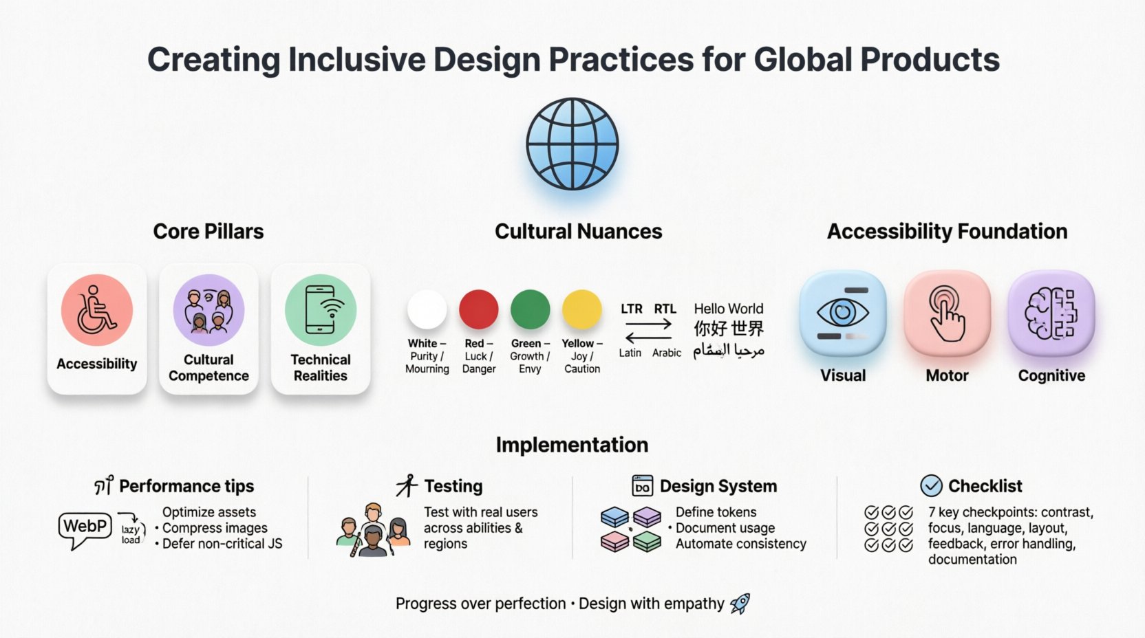
Understanding the Scope of Inclusive Design 🧩
Inclusive design sits at the intersection of accessibility and cultural relevance. While accessibility focuses on ensuring people with disabilities can use a product, global inclusivity extends this to language, cultural norms, economic status, and infrastructure.
- Accessibility: Ensuring usability for people with visual, auditory, motor, and cognitive impairments.
- Cultural Competence: Adapting symbols, colors, and layouts to fit local expectations.
- Technical Realities: Accounting for varying internet speeds, device capabilities, and input methods.
When these elements are ignored, products risk alienating significant portions of the potential user base. A button that works perfectly in a high-speed urban environment may be unusable on a low-end device in a developing region. Similarly, an icon that signifies “save” in one country might be confusing or offensive in another.
Cultural Nuances in User Experience 🌏
Design is a language. Just as spoken language changes across borders, visual language does too. What feels intuitive in one context may feel alien in another. Understanding these differences is vital for global success.
Direction and Layout
Most Western interfaces follow a left-to-right reading pattern. However, many regions utilize right-to-left (RTL) scripts, such as Arabic and Hebrew. A simple horizontal flip is often insufficient. The layout must account for the flow of information.
- Navigation: Menus and breadcrumbs must reverse positions.
- Imagery: Arrows pointing right often mean “forward,” but in RTL contexts, this can imply “backwards.” Icons must be localized or made abstract.
- Spacing: Margins and padding need adjustment to accommodate text expansion. Arabic text often requires more vertical space than Latin script.
Color Symbolism
Colors evoke emotional responses that vary significantly by culture. A palette that feels professional in Europe might carry negative connotations elsewhere.
| Color | Common Meaning (West) | Common Meaning (East/Global) |
|---|---|---|
| White | Purity, Cleanliness | Mourning, Death (in some Asian cultures) |
| Red | Danger, Stop, Error | Good Fortune, Prosperity (China) |
| Green | Go, Success, Eco-friendly | Sacred (in some Middle Eastern contexts) |
| Yellow | Caution, Happiness | Loyalty, Marriage (in some Latin American contexts) |
Designers must conduct cultural audits before launching. This involves consulting local experts who understand the subtext of visual choices. Avoid relying on stock photography that does not reflect the actual demographic of the target market.
Typography and Fonts
Not all character sets are supported by default system fonts. Using a font that lacks support for specific scripts can lead to “tofu” (square boxes) or fallback to generic fonts that break the visual hierarchy.
- Character Width: CJK (Chinese, Japanese, Korean) characters are often more information-dense than Latin characters. Cards and containers must be flexible.
- Legibility: Some scripts require larger point sizes to maintain readability on small screens.
- Licensing: Ensure web fonts are licensed for global distribution to avoid legal issues.
Accessibility as the Foundation ♿
Accessibility is the bedrock of inclusive design. It ensures that users with disabilities are not locked out of digital services. This is not just about ethics; it is often a legal requirement in many jurisdictions.
Visual Impairments
Screen readers are essential tools for users who cannot see. These tools read the content aloud based on the underlying code structure.
- Semantic HTML: Use proper heading tags (
<h1>,<h2>) to create a logical document outline. - Alt Text: All images must have descriptive alternative text. Decorative images should have empty alt attributes.
- Contrast: Text must have sufficient contrast against its background. A low-contrast ratio makes text unreadable for users with low vision.
Motor and Physical Limitations
Not all users can use a mouse. Many rely on keyboards, voice commands, or switch devices.
- Focus States: Every interactive element must have a visible focus indicator when navigated via keyboard.
- Touch Targets: Buttons and links should be large enough to tap accurately without accidental activation.
- Hover vs. Click: Avoid critical information that is only revealed on hover. Some users cannot hover.
Cognitive Load
Complex interfaces can be overwhelming for users with cognitive disabilities. Simplicity is key.
- Clear Language: Avoid jargon, idioms, and complex sentence structures.
- Consistency: Keep navigation and interaction patterns consistent across the product.
- Error Prevention: Provide clear error messages and recovery options. Do not rely on red text alone to indicate errors.
Technical Constraints and Infrastructure 📶
Designing for the global market means acknowledging that not everyone has a high-speed connection and a flagship smartphone. In many regions, mobile data is expensive, and devices have limited processing power.
Bandwidth and Loading Times
Heavy assets can cause timeouts on slow networks. Optimizing performance is an act of inclusion.
- Image Optimization: Use modern formats like WebP and serve appropriately sized images based on device.
- Lazy Loading: Load content only when it is needed, rather than all at once.
- Offline Capability: Allow users to access core content even when connectivity is intermittent.
Device Fragmentation
There are thousands of device models with varying screen sizes and capabilities. A design that looks perfect on a large tablet may break on a budget Android phone.
- Responsive Design: Use fluid grids and flexible images that adapt to any screen width.
- Progressive Enhancement: Build a core experience that works on all devices, then add enhancements for better devices.
- Input Methods: Support both touch and mouse interactions seamlessly.
Research and User Testing 🧪
Assumptions are the enemy of inclusivity. You cannot design for a global audience without understanding who they are. Research must be diverse and representative.
Recruitment Strategies
Avoid recruiting only from tech hubs or English-speaking populations. You need participants from the actual target regions.
- Geographic Diversity: Ensure testers are from urban and rural areas.
- Ability Diversity: Include users with disabilities in your testing pool.
- Language Diversity: Use professional translators for research materials, not just machine translation.
Testing Methodologies
Different cultures have different comfort levels with feedback. Some may be reluctant to criticize a design directly.
- Observation: Watch how users interact with the product without interfering. Look for hesitation or confusion.
- Contextual Inquiry: Understand the environment where the product is used. Is it bright sunlight? Is it a noisy factory?
- A/B Testing: Test variations to see which performs better across different segments.
Avoiding Bias
Designers bring their own biases. It is crucial to recognize these and mitigate them.
- Self-Reflection: Ask how your own background influences your design choices.
- Diverse Teams: Ensure the design team itself reflects the diversity of the user base.
- Feedback Loops: Create channels for users to report issues or suggest improvements continuously.
Building a Flexible Design System 🧱
A design system provides the structure for consistency. For global products, this system must be flexible enough to adapt without breaking.
Tokenization
Use design tokens to separate style from logic. This allows for easy theming and localization.
- Color Tokens: Define semantic colors (primary, secondary) rather than fixed hex codes.
- Spacing Tokens: Use a modular scale for padding and margins that can expand for longer text.
- Typography Tokens: Define font families that support multiple languages.
Component Variants
Components should have variants for different states and locales.
- Text Expansion: Buttons must handle text that is 2x or 3x the length of the English original.
- RTL Support: Components should automatically mirror layout direction.
- Dynamic Content: Allow for variable content lengths without breaking the layout.
Continuous Improvement and Governance 🔄
Inclusivity is not a one-time project. It is an ongoing commitment that requires governance and maintenance.
Audit and Review
Regularly audit the product for compliance and inclusivity issues.
- Automated Scans: Use tools to check for common accessibility errors.
- Manual Review: Conduct manual testing with screen readers and keyboard navigation.
- Regional Checks: Review updates with local teams to ensure cultural appropriateness.
Education and Training
Keep the team informed about best practices.
- Workshops: Host regular sessions on accessibility and cultural design.
- Documentation: Maintain a living style guide that includes inclusivity guidelines.
- Guest Speakers: Invite users with disabilities to share their experiences.
Practical Checklist for Global Inclusion ✅
Before launching a feature or product, run through this checklist to ensure readiness.
| Area | Checklist Item | Status |
|---|---|---|
| Language | Is text supported for all target languages? | ⬜ |
| Direction | Does the layout support RTL and LTR? | ⬜ |
| Visuals | Are colors culturally appropriate for all regions? | ⬜ |
| Accessibility | Do all images have alt text? | ⬜ |
| Performance | Does the site load within 3 seconds on 3G? | ⬜ |
| Testing | Has it been tested with real users from the region? | ⬜ |
| Legal | Does it comply with local data and privacy laws? | ⬜ |
Conclusion on Impact 🚀
Designing for the world is a complex challenge, but the reward is a product that truly serves humanity. By prioritizing inclusivity, you build a foundation that is robust against change and resistant to exclusion.
It requires patience, research, and a willingness to listen. When you commit to these practices, you are not just building software; you are building bridges. These bridges connect people to services, ideas, and each other, regardless of their location or ability.
Start small. Audit one feature. Talk to one user from a different background. Then expand. The path to global inclusion is paved with small, deliberate actions. Keep iterating, keep learning, and keep designing with empathy at the center.
Remember, the goal is not perfection, but progress. Every step taken toward inclusivity makes the digital world a little bit better for everyone involved.

