In the digital landscape, a website is more than just a collection of pages; it is a functional tool designed to achieve specific business goals. When visitors land on a site, they are not merely browsing; they are evaluating, deciding, and acting. The bridge between a casual visitor and a paying customer is often built on the foundation of User Experience (UX). Enhancing this experience directly correlates with improved conversion rates. This guide explores the practical mechanics of aligning design choices with user psychology to drive measurable results.
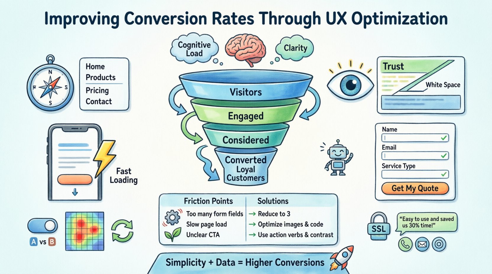
🧠 Understanding the Psychology of User Behavior
Before implementing changes, it is crucial to understand why users act the way they do. Conversion is not a random event; it is the culmination of a series of micro-decisions made by the user. These decisions are influenced by cognitive load, trust, and clarity.
- Cognitive Load: Users prefer paths of least resistance. If a page requires too much mental effort to navigate or understand, they will leave.
- Trust: Users need to feel safe providing information or money. Design elements that signal professionalism and security are vital.
- Clarity: Ambiguity kills conversion. Users must understand exactly what value they receive and what action is expected of them.
Optimization is not about tricking users into buying. It is about removing friction so the natural desire to solve a problem or acquire a service can proceed without obstruction. By mapping the user journey, we identify where hesitation occurs and apply UX principles to smooth the path.
🧭 Streamlining Navigation and Information Architecture
Navigation is the compass of a website. If users cannot find what they need quickly, they will abandon the session. A cluttered menu or confusing hierarchy increases bounce rates and reduces time on site.
Key Principles for Navigation
- Logical Grouping: Organize content based on user mental models, not internal departmental structures. For example, a clothing retailer should group items by category (Men, Women, Kids) rather than by warehouse location.
- Labeling: Use clear, concise labels. Avoid jargon or clever wordplay that might confuse the average visitor. “Services” is better than “Our Capabilities Suite”.
- Consistency: Keep the navigation bar in the same location across all pages. Users should never have to relearn the interface as they move deeper into the site.
- Search Functionality: For content-heavy sites, a robust search bar is essential. It allows users to bypass navigation layers and find specific content instantly.
Consider the depth of the site. Users should be able to reach any critical piece of information within three clicks from the homepage. If a user has to dig deeper, they are at risk of losing interest. Simplifying the path to conversion points, such as pricing or contact forms, is a primary objective here.
👁️ Visual Hierarchy and Layout
Visual hierarchy guides the user’s eye through the page. It tells them what is important, what to read first, and where to look next. Without a clear hierarchy, all elements compete for attention, leading to decision paralysis.
- Size and Scale: Larger elements attract more attention. The primary call to action should be the most prominent interactive element on the page.
- Color Contrast: Use contrasting colors to highlight buttons or important links. Ensure the contrast meets accessibility standards so all users can distinguish the action.
- White Space: Empty space is not wasted space. It separates content, reduces clutter, and allows the eye to rest. Crowded pages feel chaotic and untrustworthy.
- Z-Pattern and F-Pattern: Understand how eyes scan pages. In Western cultures, users typically scan in an “F” shape or a “Z” shape. Place key information and calls to action along these natural scanning paths.
When designing a landing page, the value proposition must be immediately visible. The headline should explain the benefit, and the supporting text should reinforce it. Below this, the primary action button should follow naturally. This flow reduces the cognitive effort required to process the message.
📱 Mobile-First Design Strategy
Mobile traffic often surpasses desktop traffic. A design that looks good on a large screen but fails on a phone will lose a significant portion of potential conversions. Mobile optimization is no longer optional; it is a baseline requirement.
Mobile UX Essentials
- Touch Targets: Buttons and links must be large enough to be tapped accurately with a finger. Small, clickable areas frustrate users and lead to misclicks.
- Vertical Scrolling: Design for vertical scrolling rather than horizontal swiping. Horizontal scrolling is often difficult on mobile devices and feels unnatural.
- Viewport Settings: Ensure the page scales correctly to the screen width. Text should be readable without zooming in.
- Speed: Mobile connections can vary. Heavy images and scripts slow down load times, increasing the likelihood of abandonment.
Forms on mobile devices are particularly sensitive. Long forms with many fields often lead to drop-offs. Simplifying the form to only essential fields and using appropriate input types (like number pads for phone numbers) improves the submission rate.
⚡ Performance and Load Times
Speed is a core component of user experience. If a page takes too long to load, users leave before seeing the content. Studies show that even a delay of one second can significantly impact conversion rates.
- Image Optimization: Compress images without sacrificing quality. Use modern formats that reduce file size while maintaining visual fidelity.
- Code Minification: Remove unnecessary characters from code files to reduce the amount of data the browser must download.
- Caching: Store static resources locally on the user’s device so they do not need to be re-downloaded on subsequent visits.
- Server Response: Ensure the hosting environment can handle traffic spikes without slowing down response times.
Performance is not just technical; it is psychological. Users perceive a fast site as a reliable site. A slow site feels broken or unprofessional. Regularly audit site speed to identify bottlenecks and resolve them proactively.
📝 Form Design and Friction Reduction
Forms are often the final step before conversion. They represent the highest point of friction in the user journey. Every field added increases the effort required to complete the task.
Optimizing Form Fields
- Minimize Fields: Only ask for information that is absolutely necessary. If email is needed, do not ask for a phone number unless it is critical.
- Inline Validation: Provide feedback immediately as the user types. If a password is too weak, state it right away rather than waiting until submission.
- Progress Indicators: For long forms, show users how far along they are. This reduces anxiety about the time commitment.
- Placeholders and Labels: Use clear labels and helpful placeholders to guide input. Avoid generic placeholders that disappear when typing begins.
Additionally, the language used in form submission buttons matters. “Submit” is generic. “Get My Quote” or “Start Free Trial” is action-oriented and reminds the user of the benefit.
🤝 Trust and Credibility Signals
Users are wary of sharing data or money online. They look for signals that indicate the business is legitimate and secure. These signals must be woven into the design naturally.
- Testimonials: Real feedback from real users builds social proof. Include names and photos if possible to increase authenticity.
- Security Badges: Display SSL certificates or payment security icons near checkout fields to reassure users their data is protected.
- Clear Contact Information: Make phone numbers, addresses, and email addresses visible. Anonymity breeds distrust.
- Media Coverage: If the company has been featured in reputable publications, display those logos prominently.
Trust is cumulative. It is built over time through consistent, professional interactions. The design should reflect stability and competence. Avoid flashy animations or aggressive pop-ups that distract from the core message.
🔄 Testing and Continuous Improvement
Design is never finished. What works for one audience may not work for another. Continuous testing allows for data-driven decisions rather than assumptions. By comparing different versions of a page, we can determine which elements resonate best.
- A/B Testing: Test two variations of a single element, such as a headline or button color. Measure which one generates more conversions.
- Heatmaps: Use tools to visualize where users click, scroll, and hover. This reveals areas of interest and points of confusion.
- Session Recordings: Watch how real users interact with the site. Observe where they hesitate or get stuck.
- Feedback Loops: Include surveys or feedback buttons to ask users directly about their experience.
Testing should be iterative. Make one change at a time to isolate its impact. Analyze the results, implement the winner, and move to the next hypothesis. This cycle ensures the site evolves with user needs.
📊 Common UX Friction Points
The following table outlines common issues that hinder conversion and their potential impact on user behavior.
| Friction Point | Impact on Conversion | Remediation Strategy |
|---|---|---|
| Slow Load Times | High Bounce Rate | Optimize images and code; use caching. |
| Confusing Navigation | Low Time on Site | Simplify menu structure; add breadcrumbs. |
| Hidden Contact Info | Low Trust | Make contact details visible in the header or footer. |
| Auto-play Audio/Video | Immediate Exit | Disable auto-play; allow user control. |
| Long Forms | High Abandonment | Reduce fields; use multi-step forms. |
| Non-Responsive Design | Mobile Traffic Loss | Implement responsive breakpoints. |
🎯 Conclusion on Strategic Alignment
Improving conversion rates is a continuous process of understanding people and refining the environment they interact with. It requires a balance between aesthetic appeal and functional utility. When users feel understood and supported, they are more likely to complete the desired action.
By focusing on navigation, visual hierarchy, mobile performance, and trust signals, organizations can create a seamless experience. The goal is not to force a conversion but to make it the most logical next step. Regular testing ensures that these improvements remain relevant as user expectations evolve. The result is a robust digital presence that converts visitors into loyal customers through clarity, speed, and reliability.
Remember that every element on a page has a purpose. If it does not serve the user or the business goal, reconsider its presence. Simplicity, backed by data, remains the most powerful tool in the UX optimization toolkit. Prioritize the user’s needs, and the metrics will follow.

