The landscape of software engineering has shifted significantly over the past decade. Where documentation once lived in static PDFs or Word documents, the modern agile environment demands dynamic, living artifacts that evolve alongside the codebase. At the heart of this transition lies the interaction overview diagram, a tool that has moved from a niche UML specification to a central component of system design and communication. As teams strive for faster delivery cycles without sacrificing quality, the visual representation of complex flows has become non-negotiable.
This guide explores the trajectory of interactive diagramming within agile methodologies. It examines how these visual tools facilitate communication, reduce technical debt, and align stakeholders across distributed teams. By understanding the mechanics of interaction overview diagrams and their integration into continuous integration pipelines, development organizations can streamline their workflow and enhance clarity.
The Evolution of Visual Communication in Engineering 📊
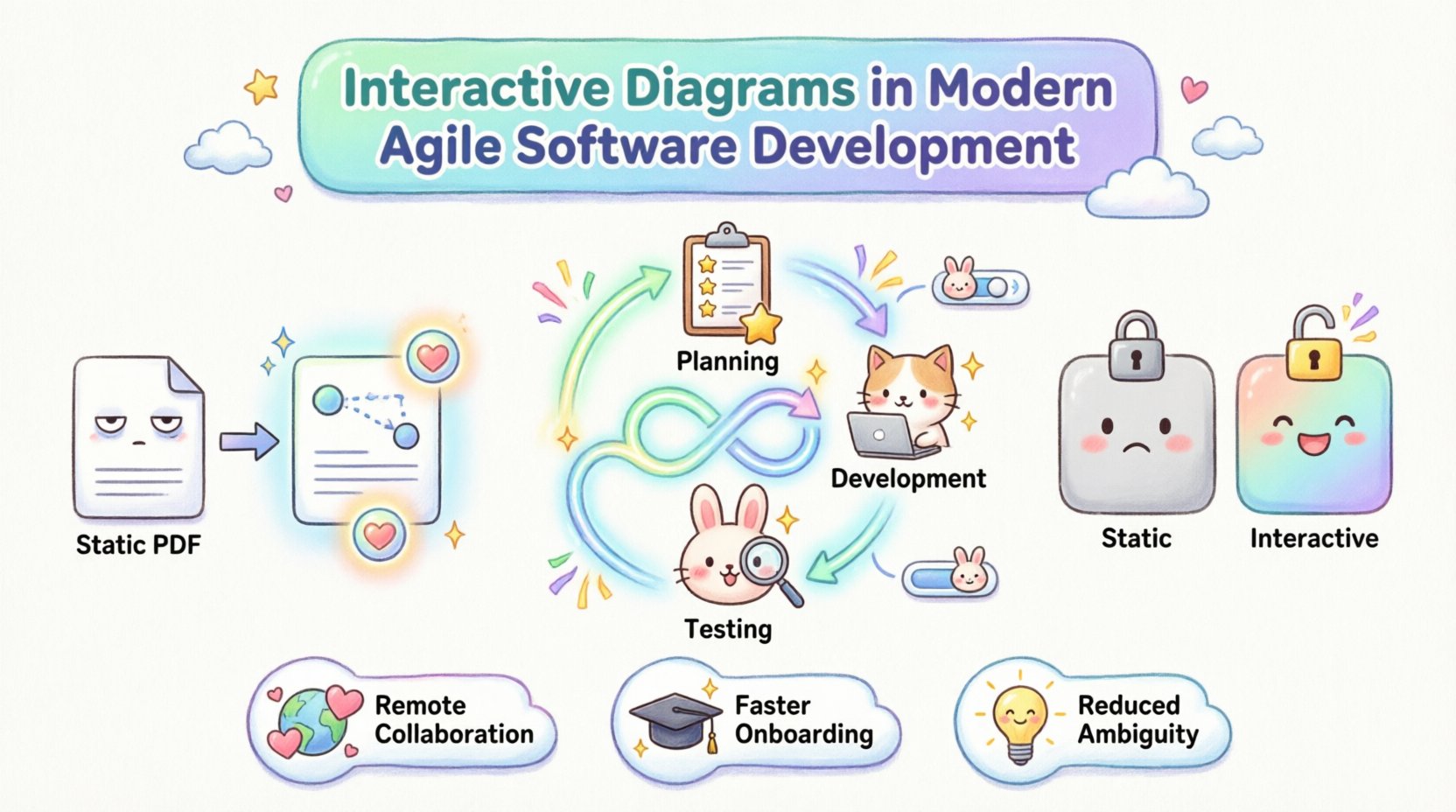
Historically, software architecture was documented after the fact. Developers would build a system, and then engineers would attempt to reverse-engineer the logic into a diagram for the purpose of handover. This approach created a disconnect between the design intent and the implemented reality. In modern agile software development, this lag is unacceptable. Iterative cycles require immediate feedback loops, and visual aids must reflect the current state of the application.
Interactive diagrams address this gap by allowing users to traverse logic paths directly within the documentation environment. Instead of reading a linear description of a function, a stakeholder can click through a flow to see how data moves from a user interface to a backend service and back again. This capability transforms the diagram from a static reference into an executable specification.
Key drivers for this evolution include:
- Remote Collaboration: With teams spread across time zones, asynchronous communication relies heavily on clear visual context. Static images often fail to convey the necessary nuance.
- Complexity Management: Modern microservices architectures involve dozens of interacting components. A single static view cannot capture the depth of these interactions effectively.
- Speed of Onboarding: New team members can interact with the diagram to understand system logic faster than reading through dense codebases or lengthy wikis.
Understanding the Interaction Overview Diagram 🧩
An interaction overview diagram is a specific type of diagram used in the Unified Modeling Language (UML). It combines the structural aspects of an activity diagram with the behavioral aspects of sequence diagrams. While a sequence diagram focuses on the order of messages between objects, an interaction overview diagram provides a high-level view of how multiple interactions are organized and controlled.
In the context of interactive tools, this definition expands. The diagram becomes a navigational map. Users can zoom into specific interaction nodes to see the detailed sequence of events. This hierarchical approach allows architects to maintain a high-level overview while drilling down into implementation details when necessary.
Core characteristics of a robust interaction overview diagram include:
- Control Flow: Clear representation of decision points, loops, and parallel paths within a process.
- Object Focus: Identification of the specific objects or services participating in each interaction.
- Message Sequencing: The logical order in which information is exchanged between components.
- State Transitions: Visibility into how the state of a system object changes throughout the interaction.
When these diagrams are made interactive, they allow for filtering. A developer might view the diagram filtered by “Error Handling” paths, while a product manager views the “Happy Path” scenarios. This flexibility ensures that the diagram remains relevant to different roles within the organization.
Integrating Diagrams into Agile Workflows ⚙️
Agile methodologies prioritize working software over comprehensive documentation. However, this does not mean documentation is abandoned. It means documentation must be lean, valuable, and integrated into the workflow. Interactive diagrams fit this model perfectly because they can be treated as living artifacts.
In a typical sprint cycle, the interaction overview diagram serves multiple functions. During the planning phase, it helps the team estimate the complexity of a feature by visualizing the required backend interactions. During development, it acts as a guide for implementation, ensuring that the code aligns with the designed flow. During testing, it provides a checklist of scenarios that must be validated.
Integration strategies include:
- Diagram as Code: Treating the diagram definition as a source file stored in the version control system alongside the application code. This ensures that diagram changes trigger version history and review processes.
- Automated Synchronization: Using tools to detect when code changes alter the system flow and alerting the team if the diagram needs updating.
- Linkage to User Stories: Connecting specific nodes in the diagram to user stories in the project management tool. This creates a direct traceability path from requirement to implementation.
By embedding these visual artifacts into the sprint rhythm, teams avoid the common pitfall of documentation becoming obsolete the moment a sprint concludes. The diagram evolves with the product.
Benefits of Interactivity for Stakeholder Alignment 🤝
One of the greatest challenges in software development is bridging the gap between technical and non-technical stakeholders. Business analysts, product owners, and developers often speak different languages. Interactive diagrams serve as a universal translator.
When a product owner clicks on a decision node in an interactive diagram, they can see the specific business rules governing that decision. They do not need to understand the underlying code logic to see that a discount is applied only if the user is a premium member. This transparency builds trust and reduces the friction during requirement gathering sessions.
Furthermore, interactivity allows for simulation. In some advanced setups, stakeholders can input mock data into the diagram to see how the system responds. This “what-if” analysis helps identify edge cases before a single line of code is written. It shifts the cost of finding errors to the design phase, where they are significantly cheaper to fix.
Key advantages for stakeholders include:
- Reduced Ambiguity: Visual paths leave little room for interpretation compared to text-based requirements.
- Faster Feedback: Questions can be answered by navigating the diagram rather than waiting for a meeting.
- Shared Understanding: A single source of truth that both developers and business users can access and explore.
Collaboration in Distributed Teams 🌍
The shift to remote work has made asynchronous collaboration a standard requirement. In a co-located office, a developer can walk over to a colleague’s desk to clarify a flow. In a distributed environment, this convenience is removed. Interactive diagrams fill this void by providing a persistent, explorable context.
Real-time collaboration features allow multiple users to view and annotate a diagram simultaneously. This is particularly useful during retrospectives or design workshops. Participants can highlight specific paths, add comments to nodes, and tag relevant team members directly within the visual interface.
For global teams, this means a designer in one country can leave notes on a diagram that a developer in another time zone can review and act upon immediately. The diagram becomes the meeting room, accessible 24/7.
Table: Comparison of Static vs. Interactive Diagramming
| Feature | Static Diagrams | Interactive Diagrams |
|---|---|---|
| Update Frequency | Low (Often Outdated) | High (Synchronized with Code) |
| Navigation | Linear, Manual | Non-Linear, Click-Through |
| Detail Level | Fixed | Drill-Down Capable |
| Stakeholder Access | PDF/Image View Only | Executable Simulation |
| Traceability | Difficult | Direct Links to Code/Requirements |
Challenges and Mitigation Strategies ⚠️
Despite the clear benefits, adopting interactive diagramming introduces new challenges. The primary concern is maintenance. If a diagram is too complex, keeping it updated becomes a burden. Teams must establish governance policies regarding who can modify the diagram and how often it must be reviewed.
Another challenge is the learning curve. Not all team members are familiar with UML standards or the specific notation used in interactive tools. Training is required to ensure that the diagrams are interpreted correctly across the organization.
To mitigate these risks, teams should:
- Standardize Notation: Adopt a consistent set of symbols and rules for diagram creation.
- Limit Scope: Do not attempt to diagram the entire system at once. Focus on specific modules or critical paths.
- Automate Where Possible: Use generation tools to create diagrams from existing code to reduce manual entry.
- Assign Owners: Designate specific individuals responsible for the integrity of the documentation.
Emerging Technologies and AI 🤖
The future of interactive diagrams is closely tied to advancements in artificial intelligence and machine learning. AI can assist in generating diagrams from code repositories, automatically identifying interaction patterns and suggesting visual layouts.
Furthermore, predictive analytics could be integrated into these diagrams. An interactive diagram might highlight paths that are prone to errors based on historical data. It could suggest optimizations in the flow to improve performance or reduce latency.
Looking ahead, we can expect:
- Natural Language Processing: Converting text-based requirements directly into interactive diagram structures.
- Context-Aware Suggestions: The diagram suggests the next logical step in a workflow based on user behavior.
- Real-Time Performance Monitoring: Overlaying live metrics onto the diagram nodes to show current system health.
Maintenance and Lifecycle Management 🔄
A diagram is only as good as its accuracy. If it does not reflect the current state of the software, it becomes noise rather than signal. Lifecycle management involves ensuring the diagram stays synchronized with the application.
This requires a cultural shift where updating the diagram is considered part of the definition of “done” for a feature. Just as code is reviewed, the diagram must be reviewed during pull requests. If a code change alters the interaction flow, the diagram update is a blocking requirement.
Version control for diagrams is essential. Changes should be tracked, allowing teams to revert to previous versions if a new design proves problematic. This history provides insight into how the system architecture has evolved over time.
Final Thoughts on Visualization Strategy 💡
The adoption of interactive diagrams represents a maturation in how engineering teams manage complexity. It moves the organization away from static, backward-looking documentation toward dynamic, forward-looking tools. By leveraging interaction overview diagrams effectively, teams can improve communication, reduce errors, and accelerate delivery.
The goal is not to create perfect diagrams, but to create useful ones. These tools should simplify the understanding of the system, not add to the cognitive load. When implemented with discipline and a focus on practical utility, interactive diagrams become a cornerstone of modern agile software development.
As the industry continues to evolve, the ability to visualize and interact with system logic will remain a critical competency. Organizations that invest in these capabilities today will find themselves better equipped to handle the complexities of tomorrow.

