In the landscape of user experience design, the wireframe stands as the foundational blueprint for digital products. It is the stage where ideas transition from abstract concepts into tangible structures. However, a wireframe is not merely a collection of boxes and lines; it is a communication tool. Its primary objective is to convey functionality clearly before a single line of code is written or a pixel is styled. When wireframes succeed, they align stakeholders, clarify user flows, and prevent costly rework during development.
This guide explores the mechanics of building wireframes that prioritize functionality. We will move beyond basic layout to discuss how to represent interactions, states, and information architecture effectively. By focusing on clarity and utility, designers can ensure that the final product meets user needs and business goals.
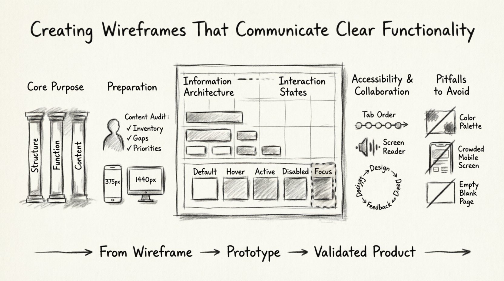
Understanding the Core Purpose of Wireframes 🧱
Wireframing is often confused with visual design or prototyping. It is crucial to distinguish these stages. Visual design focuses on aesthetics, branding, and typography. Prototyping focuses on the flow and interactivity of the final product. Wireframing sits in the middle, focusing on structure and function.
- Structure: Defining the layout of elements on a page.
- Function: Determining what elements do and how they behave.
- Content: Establishing the hierarchy of information.
When a wireframe communicates functionality well, it answers critical questions before development begins:
- What happens when a user clicks this button?
- Where does the user go next?
- How does the system respond to errors?
- Is the information hierarchy logical?
By addressing these questions early, teams reduce ambiguity. Developers gain clarity on logic requirements. Product managers verify that business rules are met. Designers ensure usability is baked into the foundation.
Preparation and Research Before Drawing 📝
Jumping straight into drawing shapes without context leads to inefficient wireframes. Preparation ensures that the structure supports the intended functionality. This phase involves gathering data and defining constraints.
1. Define User Goals and Scenarios
Every screen must serve a specific user goal. Understanding who is using the interface and why helps determine what functionality is necessary. Consider the following:
- User Personas: Who are the primary users?
- Tasks: What specific actions must they complete?
- Context: Where will they be using the interface?
For example, a task to purchase an item requires different functionality than a task to browse content. The former needs a checkout flow, payment forms, and confirmation states. The latter needs filters, search, and navigation menus.
2. Audit Existing Content
If an existing product is being improved, audit the current content. Identify what is working and what is not. This prevents carrying over cluttered functionality that confuses users. List all required content types, such as text, images, videos, and forms.
3. Establish Technical Constraints
Understand the platform limitations. Mobile screens have less space than desktop monitors. Touch targets must be large enough for fingers. Network latency might affect how data loads. Acknowledging these constraints during the wireframing stage ensures that the proposed functionality is feasible.
Information Architecture and Layout Principles 🏗️
Functionality relies on organization. If a user cannot find a feature, it effectively does not exist. Information architecture (IA) dictates how content is grouped and labeled. Wireframes visualize this structure.
Hierarchy and Focus
Not all elements are equal. Visual hierarchy guides the eye to the most important actions. In a wireframe, this is achieved through size, placement, and spacing.
- Primary Actions: These should be prominent. Examples include “Submit,” “Add to Cart,” or “Sign Up.” They often occupy the top right or center of the screen.
- Secondary Actions: These are important but less critical. Examples include “Save Draft” or “Cancel.” They can be smaller or less visually weighted.
- Navigation: This should be consistent across pages to prevent disorientation.
Grid Systems and Whitespace
Using a grid system brings order to the layout. It ensures elements align logically. Whitespace is equally important. It separates related content from unrelated content, reducing cognitive load.
| Element | Functionality Indicator | Wireframe Representation |
|---|---|---|
| Input Field | Accepts text | Box with label and placeholder text |
| Button | Triggers action | Rectangular shape with text label |
| Link | Navigates to page | Underlined text or distinct color |
| Image | Visual content | Placeholder box with icon |
Visualizing Functionality and Interactions 🔄
This is the most critical aspect of functional wireframing. Static boxes do not tell the whole story. Designers must indicate how elements behave when interacted with. This includes hover states, click states, and error states.
Interaction States
Buttons are not static. They change appearance based on user interaction. A functional wireframe should show these variations.
- Default: The resting state before interaction.
- Hover: Visual feedback when the cursor is over the element.
- Active: The state while the element is being clicked.
- Disabled: An inactive state where interaction is blocked.
- Focus: Highlighting when an element is selected via keyboard navigation.
Indicating these states in a wireframe prevents developers from guessing. It ensures the feedback loop feels responsive and intentional.
Form Functionality
Forms are complex functional areas. They require validation, error handling, and success messages. A robust wireframe addresses these details.
- Required Fields: Indicate which fields must be filled. Use asterisks or labels.
- Validation: Show what happens if a user enters invalid data. For example, a red border or a message saying “Email is required.”
- Error Messages: These should be clear and actionable. Avoid generic messages like “Error 404.”
- Success States: Confirm when a form is submitted successfully. This reassures the user.
Navigation and Flows
Wireframes often exist in isolation. To communicate functionality, show how screens connect. Use arrows or flow lines to indicate movement. This helps stakeholders understand the journey.
- Linear Flows: Step-by-step processes like a checkout wizard.
- Non-Linear Flows: Dashboards where users jump between modules.
- Back Buttons: Indicate if a “Back” action is available and where it leads.
Accessibility and Inclusivity in Wireframes ♿
Functionality must be accessible to everyone. Excluding users with disabilities limits the reach and utility of the product. Accessibility considerations should begin at the wireframing stage, not after design.
Keyboard Navigation
Many users navigate without a mouse. They use tab keys to move between elements. Wireframes should indicate the tab order. This ensures that focus moves logically from one element to the next.
Screen Reader Compatibility
Text labels must be descriptive. Instead of “Click Here,” use “Read More About Services.” This helps screen readers convey context to visually impaired users. Wireframes should label all interactive elements clearly.
Color and Contrast
While wireframes are usually monochromatic, the intent for contrast should be noted. Ensure that interactive elements are distinguishable from static content. If color is used to convey meaning (like red for errors), text labels should accompany it.
Collaboration and Feedback Loops 🤝
A wireframe is a living document during the design process. It is meant to be shared, critiqued, and revised. Effective collaboration ensures that functionality remains aligned with requirements.
Stakeholder Reviews
Present wireframes to stakeholders early. Ask specific questions about functionality:
- Does this flow match the business process?
- Are we missing any critical steps?
- Is the information hierarchy clear?
Feedback should be targeted. Avoid comments on aesthetics like “make it prettier.” Focus on utility like “this button should be more visible” or “this step is confusing.”
Developer Handoff
Developers need clarity on logic. Annotations can help explain complex interactions. Markers or notes can specify behavior that is not obvious from the visual layout.
- Conditional Logic: Note when elements appear or disappear based on user input.
- Data Sources: Indicate where content comes from (e.g., API, database).
- Edge Cases: Document what happens with empty states or long text strings.
Common Pitfalls to Avoid ⚠️
Even experienced designers make mistakes in wireframing. Avoiding these pitfalls saves time and improves the final product.
1. Focusing Too Much on Aesthetics
Using images, colors, and fonts too early distracts from functionality. Stick to grayscale and simple shapes. This keeps the focus on structure and behavior.
2. Ignoring Mobile Constraints
Designing for desktop and assuming it works on mobile is a common error. Mobile screens have limited space. Functionality must be prioritized. Navigation often shifts to a hamburger menu. Buttons need to be touch-friendly.
3. Overcomplicating the Layout
Too many features on one screen confuse users. Break complex tasks into smaller steps. Use pagination or progressive disclosure to manage information density.
4. Skipping Empty States
What happens when there is no data? A blank screen is frustrating. Wireframe empty states with helpful messages or actions, such as “No items found. Try a different search.”
5. Neglecting Loading States
Users need feedback when actions are processing. Indicate loading spinners or progress bars. This prevents users from clicking multiple times and causing duplicate actions.
From Wireframe to Prototype 🚀
Once the wireframe communicates functionality clearly, it serves as a guide for prototyping. Prototyping adds interactivity, but the logic is defined in the wireframe. This transition should be smooth.
- Validate Logic: Test the flow with users using the wireframe. Ask them to perform tasks. Observe where they hesitate.
- Iterate: Use feedback to refine the structure. Do not move to high-fidelity design until the wireframe is validated.
- Document: Keep a record of changes. This helps developers understand the evolution of the product.
Conclusion on Functional Clarity 🎯
Creating wireframes that communicate clear functionality requires discipline and attention to detail. It involves understanding user needs, technical constraints, and interaction logic. By prioritizing structure over style, designers build a solid foundation for successful products.
Remember that wireframes are tools for thinking and communication. They bridge the gap between abstract ideas and concrete reality. When done well, they reduce risk, save resources, and create better experiences for users. Focus on the function, ensure the flow is logical, and validate the structure with your team. This approach leads to digital products that work as intended and deliver value.
Adopting these practices ensures that every element on the screen has a purpose. It transforms the design process from a guessing game into a systematic engineering of user experiences. With clear wireframes, the path to development becomes predictable and efficient.
Start each project by defining the function. Build the structure to support that function. Refine the interaction to support the user. And always keep the end goal in mind. Clear functionality leads to clear success.

