Building a design system is not merely about creating a library of buttons and inputs. It is about establishing a single source of truth that aligns product strategy with visual execution. When organizations scale, consistency becomes the primary driver of efficiency and user trust. This guide outlines the architectural principles required to construct a scalable design system from the ground up, ensuring longevity and adaptability.
Without a robust framework, digital products risk fragmentation. Teams duplicate work, interfaces diverge, and technical debt accumulates rapidly. By adopting a systematic approach, teams can streamline workflows, reduce cognitive load for developers, and maintain brand integrity across complex ecosystems. This process requires discipline, clear communication, and a willingness to iterate based on real-world usage.
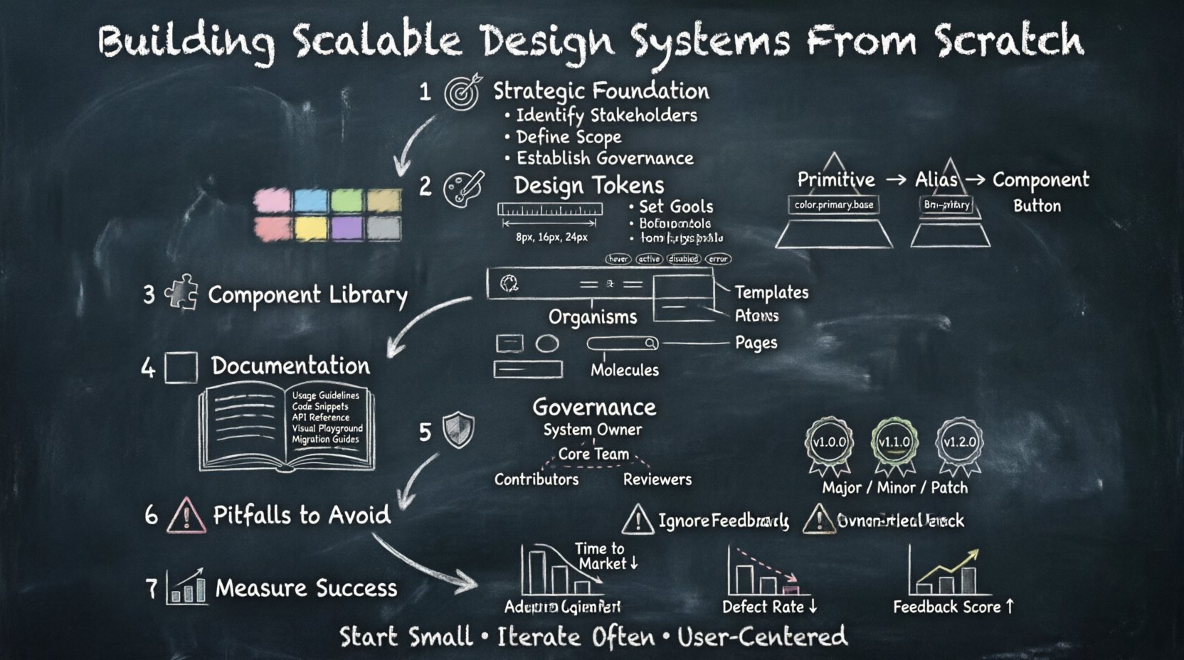
1. Defining the Strategic Foundation 🎯
Before drawing a single shape, the purpose of the system must be clearly articulated. A design system is a living product, not a static asset. It serves multiple stakeholders, including designers, developers, product managers, and content strategists. Understanding these needs prevents the creation of a tool that looks good but fails in practice.
- Identify Stakeholders: Who will consume the system? Is it for internal teams only, or will it be open to external partners?
- Define Scope: Will this cover web, mobile, desktop, or embedded devices? Start with the highest priority platforms to validate the workflow.
- Set Goals: Are you aiming to reduce development time, improve accessibility, or unify the brand voice?
- Establish Governance: Determine how decisions are made early. Who has the authority to approve new components or deprecated features?
Strategic alignment prevents scope creep. A system that tries to solve every possible problem at once often becomes too complex to maintain. Instead, focus on the core experiences that drive value. Document the mission statement and keep it visible to all contributors to ensure everyone moves in the same direction.
2. Establishing Design Tokens 🎨
Design tokens are the atomic units of style. They are named entities that store visual design attributes such as colors, spacing, typography, and shadows. By abstracting these values from the code, teams can update the system globally without touching individual component files. This abstraction layer is critical for scalability and theme customization.
Token Hierarchy
A well-structured token system follows a hierarchy from primitive to semantic values.
- Primitive Tokens: These are the raw values. For example, a hex color code like #FF5733 or a pixel value like 16px. They should never be referenced directly in components.
- Component Tokens: These map primitives to specific UI elements. A button background color might reference a primitive color token but is named for its usage context.
- Alias Tokens: These are semantic names that represent meaning. Instead of using a specific blue, use “primary-action” or “brand-primary”. This allows for easy theming, such as switching from a light to a dark mode without changing code.
Key Considerations for Tokens
- Naming Conventions: Use a consistent naming structure, such as BEM or hierarchical dot notation (e.g.,
color.primary.base). This prevents conflicts and makes the system readable. - Accessibility: Ensure token values meet contrast requirements. Define tokens for focus states and error indicators that adhere to WCAG guidelines.
- Responsive Values: Tokens should account for different screen sizes. Spacing tokens might vary between mobile and desktop breakpoints.
- Animation: Include tokens for duration and easing functions to ensure motion feels consistent across the product.
Managing tokens requires a centralized repository. Changes here propagate automatically to all connected interfaces. This reduces the risk of drift and ensures that a change in brand color reflects instantly everywhere.
3. Architecting the Component Library 🧩
Components are the building blocks of the user interface. They combine tokens to create functional UI elements. A scalable component library is organized logically, making it easy for developers to find and implement the right element. The architecture should follow the principles of atomic design, grouping elements by complexity and reusability.
Component Structure
- Atoms: Basic elements like icons, labels, and inputs. They cannot exist independently.
- Molecules: Groups of atoms functioning together, such as a search bar combining an input, button, and icon.
- Organisms: Complex sections of the interface, like a navigation header or a product card grid.
- Templates: Page-level layouts that place organisms into a specific structure.
- Pages: Instances of templates with real content.
States and Variants
Every component must account for various states to handle user interaction gracefully. A complete component definition includes:
- Default: The standard appearance.
- Hover: Visual feedback when the cursor is over the element.
- Active/Pressed: The state during interaction.
- Disabled: Non-interactive states, often with reduced opacity.
- Error: Indicators for validation failures.
- Loading: Spinning indicators or skeleton screens.
Furthermore, consider variants. A button might have primary, secondary, and tertiary styles. A text input might have a filled or outlined variant. Defining these upfront prevents the need for constant overrides in the code.
Accessibility Integration
Accessibility cannot be an afterthought. Components must be built with semantic HTML structures and ARIA attributes where necessary. Keyboard navigation must be logical, and focus indicators must be clearly visible. Screen reader compatibility is essential for inclusive design. Testing components with assistive technologies during the build phase saves significant rework later.
4. Documentation and Developer Handoff 📚
Documentation is the bridge between design and engineering. If developers cannot understand how to use a component, they will not use it. Documentation should be comprehensive, searchable, and always up to date. It serves as the primary reference point for the entire team.
Effective documentation includes:
- Usage Guidelines: Clear rules on when to use specific components. Show both correct and incorrect examples.
- Code Snippets: Ready-to-use code for common frameworks. This reduces the barrier to entry for developers.
- API Reference: A detailed list of props, parameters, and events for each component.
- Visual Playground: An interactive environment where components can be explored and tested without writing code.
- Migration Guides: Instructions for moving from older versions to new ones when breaking changes occur.
Documentation should be treated as code. It lives in the same repository as the components, ensuring that updates to the system trigger updates to the docs. This synchronization prevents the common issue of outdated guides.
5. Governance and Maintenance Protocols 🛡️
A system without governance becomes chaotic. Governance defines how the system evolves, who contributes, and how quality is maintained. It establishes the rules of engagement for the community using the system.
Roles and Responsibilities
| Role | Responsibility |
|---|---|
| System Owner | Responsible for the overall vision, roadmap, and final approval of changes. |
| Core Team | Designs and develops the foundational components and tokens. |
| Contributors | Propose new components or improvements based on project needs. |
| Reviewers | Ensure contributions meet quality standards and accessibility guidelines. |
Versioning Strategy
Use semantic versioning to manage changes. This helps consumers understand the impact of updates.
- Major Version: Breaking changes. Requires significant migration effort.
- Minor Version: New features that are backward compatible.
- Patch Version: Bug fixes and minor improvements.
Communication is key during updates. Notify all teams before a major release. Provide a changelog that details what changed and why. This transparency builds trust and encourages adoption.
6. Common Pitfalls to Avoid ⚠️
Building a system is a complex endeavor. Several common mistakes can derail the process before it gains traction. Awareness of these pitfalls helps in planning a smoother implementation.
- Over-Engineering: Do not build for every possible scenario. Start with the most common use cases and expand later. Overly complex systems become hard to use.
- Lack of Adoption: If the system is too difficult to integrate, teams will revert to local styles. Ensure the onboarding process is simple and the tools are accessible.
- Ignoring Feedback: Do not build in a vacuum. Regularly survey the teams using the system. Their feedback drives necessary improvements.
- Static Documentation: Documentation that is never updated becomes a liability. Automate the process where possible to keep it fresh.
- Siloed Teams: Ensure designers and developers work together. A system built without engineering input often fails to meet technical constraints.
7. Measuring System Health 📊
To ensure the design system remains valuable, track specific metrics. These indicators help determine if the system is achieving its goals and where adjustments are needed.
- Adoption Rate: What percentage of new screens or features use the system components?
- Contribution Volume: How many issues or pull requests are being submitted by the community?
- Time to Market: Is development time decreasing for new features due to reusable components?
- Defect Rate: Are there fewer UI bugs reported across the product?
- Feedback Score: Regular surveys to gauge satisfaction among users of the system.
Regularly review these metrics to make data-driven decisions. If adoption is low, investigate whether the documentation is unclear or if the components are too rigid. If the defect rate is high, focus on testing and quality assurance protocols.
Final Thoughts on Longevity 🚀
Constructing a scalable design system is an investment in the future of your product. It requires patience, collaboration, and a commitment to quality. The goal is not to create a perfect system immediately, but to establish a foundation that can grow with your organization.
By focusing on strategic alignment, tokenization, component architecture, and robust governance, you create an environment where consistency thrives. This consistency translates to better user experiences and more efficient development cycles. As your product evolves, the system evolves with it, ensuring that your digital presence remains cohesive and reliable.
Start small, iterate often, and keep the user at the center of every decision. The result is a resilient infrastructure that empowers teams to build faster and better.

