Creating digital products that work for everyone is a core responsibility of modern product design. Accessibility is not a checkbox to tick off at the end of a project; it is a fundamental design principle that influences decisions from the very first sketch. When designers integrate accessibility standards early, they build interfaces that are usable, inclusive, and robust.
This guide outlines the essential standards you need to know. It covers the Web Content Accessibility Guidelines (WCAG), visual design requirements, interaction patterns, and content strategies. By adhering to these guidelines, you ensure that your designs support users with diverse abilities, including those who are blind, deaf, have motor impairments, or have cognitive differences.
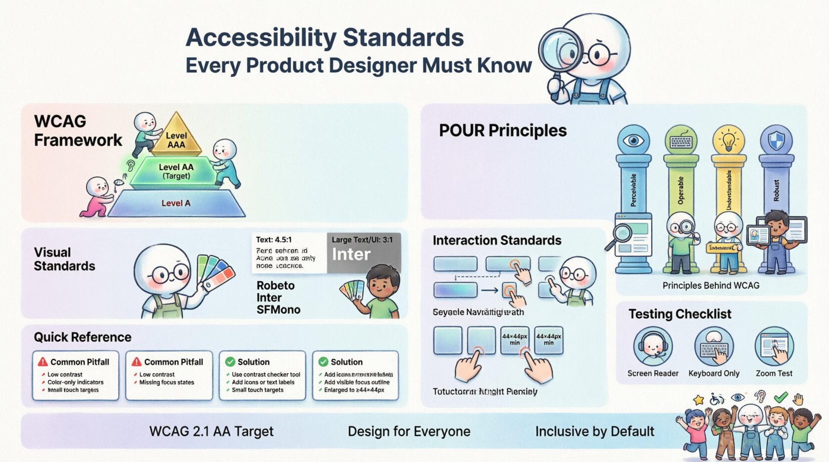
🌐 Understanding the WCAG Framework
The Web Content Accessibility Guidelines (WCAG) are the international standard for web accessibility. Managed by the World Wide Web Consortium (W3C), these guidelines provide a framework for making web content more accessible to people with disabilities. While originally focused on the web, these principles apply broadly to software, apps, and digital products.
The guidelines are organized into three levels of conformance:
- Level A: The minimum level of accessibility. If a site fails this, it is not accessible at all.
- Level AA: The mid-range level. This is the target for most legal compliance and industry standards.
- Level AAA: The highest level of accessibility. While ideal, this is often not possible to achieve for all content.
Most organizations aim for WCAG 2.1 Level AA compliance. This balance ensures a high standard of usability without making development unfeasible. Designers should familiarize themselves with the specific success criteria within this level.
🏗️ The Four Principles of Accessibility (POUR)
The WCAG is built upon four core principles. Every design decision should be evaluated against these pillars. If a design fails any of these principles, it is not accessible.
1. Perceivable
Information and user interface components must be presentable to users in ways they can perceive. Users must be able to perceive the information being presented, regardless of their sensory capabilities.
- Text Alternatives: Provide text alternatives for non-text content. For example, images must have descriptive alt text.
- Time-Based Media: Provide alternatives for time-based media, such as captions for videos.
- Adaptable: Create content that can be presented in different ways without losing information.
- Distinguishable: Make it easier for users to see and hear content.
2. Operable
User interface components and navigation must be operable. All functionality must be available from a keyboard, and users must have enough time to read and use content.
- Keyboard Accessible: All functionality must be operable using a keyboard interface.
- Enough Time: Users must be given enough time to read and use content.
- Seizures and Physical Reactions: Do not design content that causes seizures.
- Navigable: Provide ways to help users navigate, find content, and determine where they are.
3. Understandable
Information and the operation of the user interface must be understandable. Users must be able to understand the information as well as the operation of the user interface.
- Readable: Make text content readable and understandable.
- Predictable: Make Web pages appear and operate in predictable ways.
- Input Assistance: Help users avoid and correct mistakes.
4. Robust
Content must be robust enough to be interpreted reliably by a wide variety of user agents, including assistive technologies.
- Compatible: Maximize compatibility with current and future user tools.
- Valid Code: Ensure code is valid so screen readers and browsers can interpret it correctly.
🎨 Visual Design Standards
Visual design plays a critical role in accessibility. High contrast, clear typography, and thoughtful color usage ensure that content is readable for everyone, including those with low vision or color blindness.
Color Contrast
Contrast is the difference in luminance or color that makes an object distinguishable. Low contrast text is difficult to read for many users, especially those with visual impairments.
- Normal Text: Standard text must have a contrast ratio of at least 4.5:1 against its background.
- Large Text: Text that is 18pt or 14pt bold must have a contrast ratio of at least 3:1.
- UI Components: Icons and UI parts must have a contrast ratio of at least 3:1 against adjacent colors.
Do not rely on color alone to convey information. For instance, if you indicate an error with red text, also include an icon or a text message explaining the error.
Typography and Spacing
Font choice and spacing significantly impact readability. Sans-serif fonts are generally easier to read on screens than serif fonts.
- Font Size: Base font size should be at least 16px. Avoid using size to convey importance alone.
- Line Height: Ensure line height is at least 1.5 times the font size to prevent lines from merging visually.
- Letter Spacing: Increase tracking to improve legibility for users with dyslexia or low vision.
- Paragraph Spacing: Ensure adequate spacing between paragraphs to separate blocks of text.
⌨️ Interaction and Navigation Standards
Interaction design must account for users who cannot use a mouse. This includes people with motor impairments who rely on keyboards, switch devices, or voice control.
Keyboard Navigation
Users must be able to navigate the entire interface using only a keyboard. Tab order must be logical, following the visual flow of the page.
- Tab Order: Ensure focus moves logically through the interface.
- Focus Indicators: Never remove the default focus outline. If you customize it, ensure it is visible and distinct from the surrounding content.
- Skip Links: Provide a mechanism to skip repetitive content, such as navigation menus.
Focus Management
When content changes dynamically, focus must be managed correctly. For example, if a modal opens, focus should move into the modal. When it closes, focus should return to the element that triggered it.
Touch Targets
For mobile and touch interfaces, interactive elements must be large enough to be tapped accurately.
- Minimum Size: Touch targets should be at least 44×44 CSS pixels.
- Spacing: Ensure sufficient spacing between targets to prevent accidental activation.
📝 Content and Semantic Structure
Content structure helps assistive technologies understand the hierarchy and meaning of information. Semantic HTML is the foundation of this structure.
Headings and Hierarchy
Use headings to structure content logically. Users often skip through headings to find information quickly.
- Logical Order: Do not skip heading levels. Go from H1 to H2, then H3. Do not jump from H1 to H4.
- Descriptive Text: Headings should clearly describe the content that follows.
Forms and Labels
Forms are complex interaction points that require clear labeling and error handling.
- Associated Labels: Every input field must have a label programmatically associated with it.
- Error Identification: Errors must be identified in text and announced by screen readers.
- Error Suggestion: Provide suggestions on how to correct the error.
Images and Icons
Images convey information that must be accessible to users who cannot see them.
- Alt Text: Provide alternative text that conveys the same function or meaning as the image.
- Decorative Images: If an image is purely decorative, mark it as such so screen readers ignore it.
- Complex Images: Provide long descriptions for complex charts or diagrams.
📊 Common Design Pitfalls vs. Solutions
Below is a table outlining common design issues and their accessibility solutions.
| Common Pitfall | Accessibility Issue | Solution |
|---|---|---|
| Low Contrast Text | Text is hard to read for low vision users. | Use a contrast checker to ensure a 4.5:1 ratio. |
| Color Only Indication | Colorblind users cannot distinguish status. | Add icons or text labels alongside color. |
| Missing Focus States | Keyboard users cannot see where they are. | Design visible focus indicators for all interactive elements. |
| Unclear Form Labels | Screen readers cannot identify input fields. | Ensure every input has a corresponding label. |
| Autoplay Media | Disturbs users and prevents focus. | Disable autoplay or provide a pause button immediately. |
| Small Touch Targets | Difficult for users with motor impairments. | Ensure targets are at least 44×44 pixels. |
🧪 Testing Your Designs
Designing for accessibility is not complete without testing. Automated tools are helpful, but they cannot catch everything.
Automated Audits
Use automated tools to catch common issues like missing alt text, low contrast, or invalid color combinations. These tools provide a baseline for compliance.
- Check Color Ratios: Verify contrast levels across the design system.
- Validate Structure: Ensure semantic tags are used correctly.
- Review Alt Text: Check that all images have descriptions.
Manual Checks
Automated tools miss context. Manual checks ensure that the user experience is logical.
- Keyboard Only: Navigate your interface using only the Tab key. Can you access everything?
- Zoom: Zoom the interface to 200%. Does content break or overlap?
- Focus Order: Does the focus move logically through the interface?
User Testing
Nothing beats feedback from real users. Include people with disabilities in your user research.
- Recruit Diverse Users: Include users with visual, motor, and cognitive impairments.
- Observe Tasks: Watch how users complete key tasks without intervening.
- Gather Feedback: Ask users about their experience and pain points.
🏛️ The Role of Design Systems
Design systems are powerful tools for scaling accessibility. By building accessibility into the component library, you ensure consistency across the entire product.
- Standardized Components: Create accessible versions of buttons, inputs, and modals.
- Token Management: Define color and spacing tokens that meet contrast and size requirements.
- Documentation: Clearly document accessibility requirements for each component.
- Review Process: Include accessibility checks in the design system approval workflow.
⚖️ Legal and Ethical Considerations
Beyond usability, accessibility is often a legal requirement. Governments and organizations enforce standards to ensure equal access.
Legal Compliance
Various laws mandate digital accessibility. Non-compliance can lead to lawsuits and fines.
- Section 508: Requires federal agencies to make electronic and information technology accessible.
- ADA: The Americans with Disabilities Act applies to public accommodations, including websites.
- European Accessibility Act: Sets standards for products and services in the EU.
Ethical Responsibility
Building inclusive products is the right thing to do. Excluding users based on ability limits the potential of your product and alienates a significant portion of the population.
- Market Reach: One in four adults has a disability. Ignoring accessibility shrinks your market.
- Brand Reputation: Companies known for inclusivity build stronger trust with customers.
- Future Proofing: As technology evolves, accessibility ensures your product remains usable.
🔄 Keeping Up with Changes
Accessibility standards evolve. New technologies and user needs emerge regularly. Staying informed is crucial.
- Follow Updates: Keep an eye on WCAG updates and new guidelines.
- Community Engagement: Participate in accessibility communities and forums.
- Continuous Learning: Dedicate time to study new techniques and tools.
🛠️ Integrating Accessibility into the Workflow
To make accessibility a habit, integrate it into every stage of the design process.
Research Phase
Include accessibility in your user research plan. Identify users with disabilities who might benefit from your product.
Design Phase
Apply accessibility standards during wireframing and prototyping. Do not wait until the end to fix issues.
Development Handoff
Provide clear specifications for developers. Include contrast values, focus states, and interaction details.
QA Phase
Include accessibility testing in your quality assurance checklist. Ensure that new features do not break existing accessibility.
🔍 Specific Success Criteria Deep Dive
Understanding specific success criteria helps you apply the standards precisely.
1.1.1 Non-text Content
Any non-text content that is presented to the user must have a text alternative that serves the equivalent purpose.
- Images: Alt text must describe the content.
- Buttons: If an icon is a button, the aria-label must describe the action.
2.4.7 Focus Visible
Any keyboard operable user interface has a mode of operation where the keyboard focus indicator is visible.
- Visibility: The focus indicator must be clearly visible against the background.
- Contrast: The focus indicator must meet the 3:1 contrast ratio.
3.3.3 Error Suggestion
If an input error is detected, the system suggests a correction.
- Clarity: Suggestions must be clear and actionable.
- Accessibility: The suggestion must be programmatically associated with the input.
4.1.2 Name, Role, Value
For UI components, the name and role can be programmatically determined.
- Semantic HTML: Use native HTML elements where possible.
- ARIA: Use ARIA attributes only when native HTML is insufficient.
💡 Practical Tips for Designers
Here are actionable tips to improve your daily design workflow.
- Use Contrast Tools: Keep a contrast checker plugin or tool open while designing.
- Check Font Sizes: Ensure all text scales properly when the browser font size is increased.
- Test with Screen Readers: Occasionally test your prototypes with a screen reader to understand the experience.
- Review with Peers: Have a colleague review your designs for accessibility issues.
- Document Decisions: Explain why you made certain accessibility choices in your design notes.
🌍 Global Standards
While WCAG is the primary standard, other regions have their own guidelines that often align with it.
- ISO 9241: Ergonomic requirements for office work with visual display terminals.
- EN 301 549: European standard for accessibility in public sector bodies.
- Section 508: United States federal standard.
Adhering to WCAG 2.1 AA generally satisfies most of these regional requirements.
🚧 Handling Exceptions
Sometimes, a design requirement may conflict with an accessibility standard. In these cases, document the exception and provide a workaround.
- Justification: Explain why the exception is necessary.
- Alternative: Provide an accessible alternative for users who cannot use the exception.
- Approval: Get approval from stakeholders before implementing exceptions.
📢 Advocacy and Leadership
Designers often need to advocate for accessibility within their teams and organizations.
- Educate Stakeholders: Explain the business value of accessibility.
- Share Resources: Provide articles and guides to your team.
- Lead by Example: Make your own work accessible and share it as a reference.
🔗 Resources for Further Learning
There are many resources available to deepen your knowledge.
- WCAG Official Site: The primary source for guidelines.
- WAI Tutorials: Educational materials on accessibility.
- Deque University: Training and certification for accessibility professionals.
- A11y Project: Community-driven checklist and resources.
By committing to these standards, you contribute to a more inclusive digital landscape. Accessibility is a continuous journey, not a destination. Stay curious, keep learning, and prioritize inclusivity in every design decision.
The future of design is inclusive. Your designs have the power to empower users and create experiences that work for everyone. Start applying these standards today.

